Timeline
Jan 2025 - April 2025
Disciplines
UX Research, Content Strategy, Information Architecture, Usability testing
Background
This project was part of a master’s-level UX design course at the University of Toronto. We partnered with COMMB, a local industry association, to improve the usability and navigation of their website.
Team
4 UX designers from UofT, 2 stakeholders from COMMB
Overview:
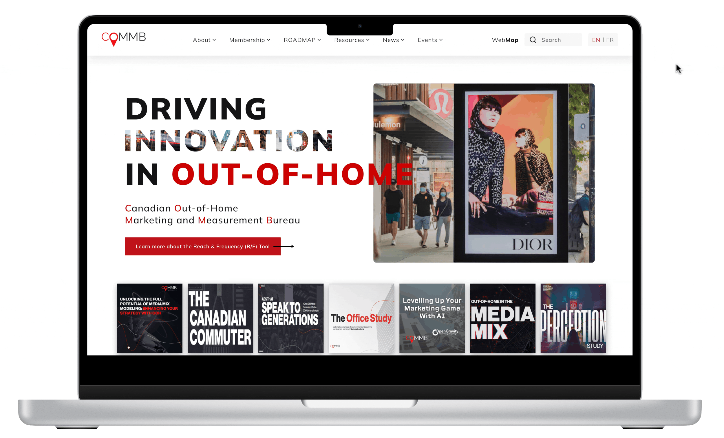
The Canadian Outdoor Marketing and Measurement Bureau (COMMB) is the authoritative body representing the Out-of-Home (OOH) advertising industry in Canada. As a central resource for advertisers, media agencies, and OOH companies, COMMB is critical in providing standardized audience measurement, research, and strategy tools that shape industry-wide media planning and investment.
COMMB’s Mission and Goals
Accurate Measurement
Delivering reliable data on OOH advertising effectiveness.
Industry Research & Insights
Helping members understand trends and market behavior.
Advocacy & Education
Promoting the value of OOH advertising and providing best practices.
Member Support
Offering data-driven solutions and marketing tools to help members grow in the industry
COMMB’s User group
Problems
From our initial meetup with COMMB stakeholders, we surfaced three key problems with the current site, each pointing us to usability gaps and opportunities to improve the experience
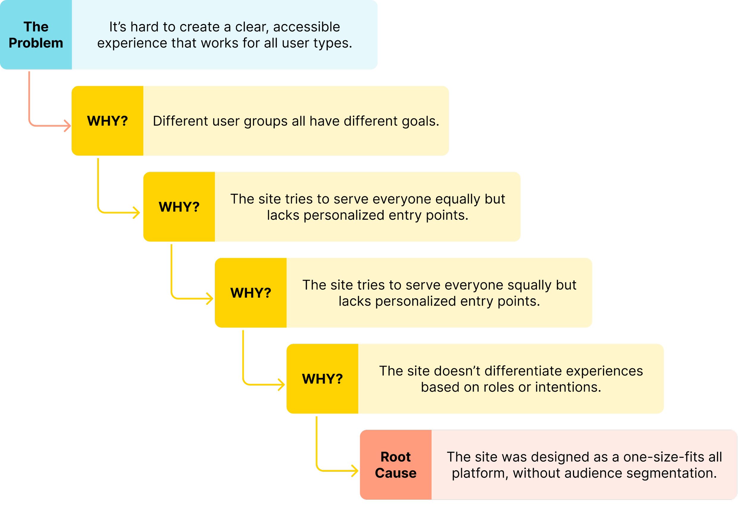
Problem 1: Diverse users, diverse needs
With such a broad audience, it's difficult yet crucial to create a clean, accessible shared space that highlights each user group’s unique objectives.
Problem 2: Complex navigation
To accommodate everyone, the site has grown in complexity: excessive dropdowns, overlapping labels, and inconsistent grouping now overwhelm users. Finding key tools or data often feels like navigating a maze.
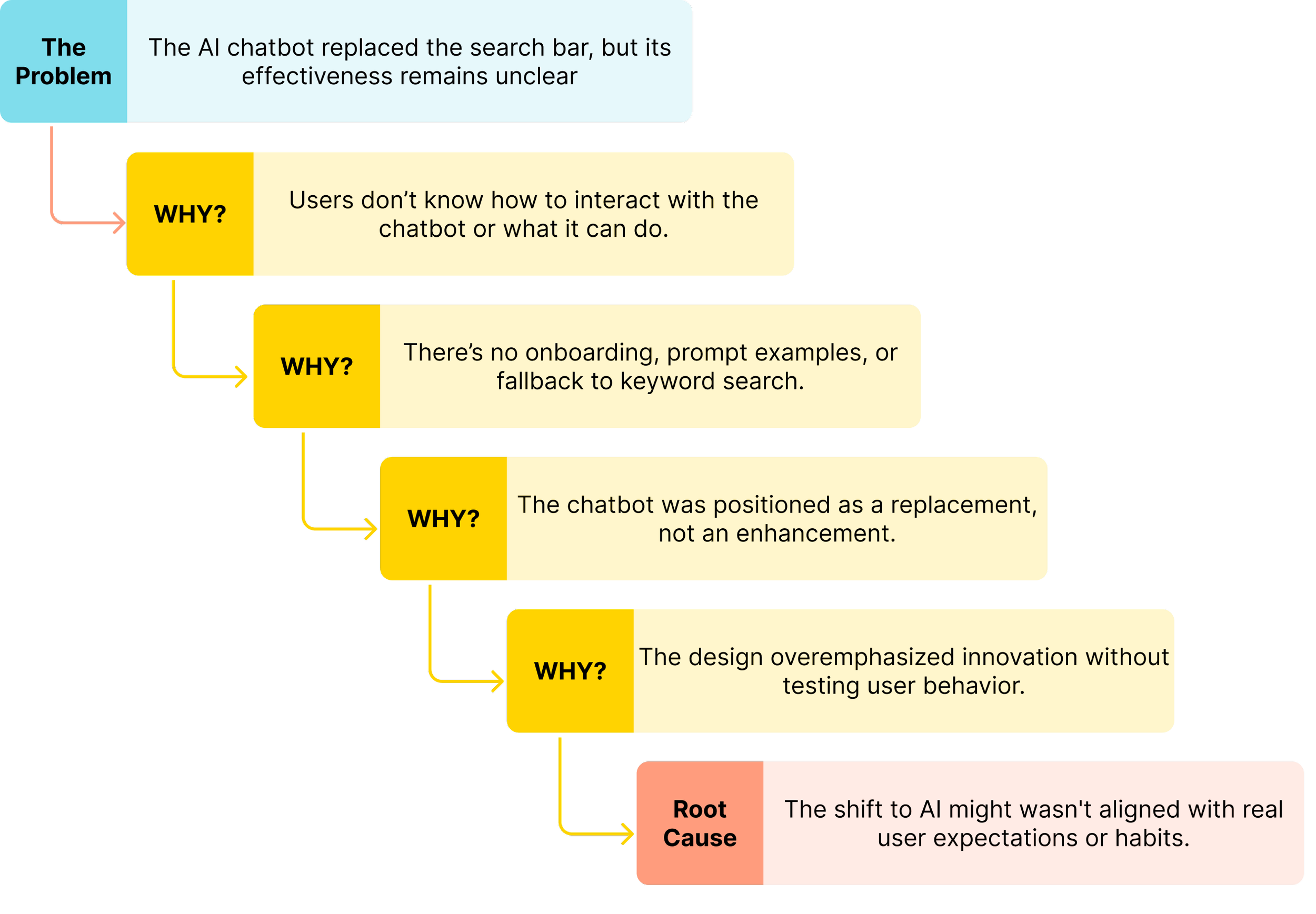
Problem 3: Limited clarity in search experience
Instead of a traditional search bar, the site now features an AI chatbot. While bold and innovative, this shift introduces friction, many users are unsure how to begin, or whether the chatbot can truly replace direct access. This becomes especially problematic for time-sensitive or goal-driven users.
Familiarity
We aimed to keep the redesign familiar, so returning users won’t need to re-learn the interface.

Other Considerations
HMW?
Alongside the core problems, we also took into account a few technical, organizational, and visual factors that could influence the design process and implementation.
Technical alignment
Throughout the process, we maintained regular check-ins with stakeholders and developers to ensure our solutions stayed technically feasible and realistic for phased implementation if needed.
How might we redesign COMMB’s navigation and homepage experience to serve diverse users, simplify access to key resources, and support both traditional and AI-driven discovery?
Visual tone updates
Stakeholders expressed concern that the current black-and-red theme may feel too intense. As part of the redesign, we explored more welcoming and balanced visual directions while respecting COMMB’s brand identity.
Research Phase
Research Questions
1.
2.
3.
How do user groups locate the specific resources and complete their most common tasks on the COMMB website differently?
Do the current section organization and excessive dropdown menus make it difficult for users to locate important information quickly?
Marketing Research
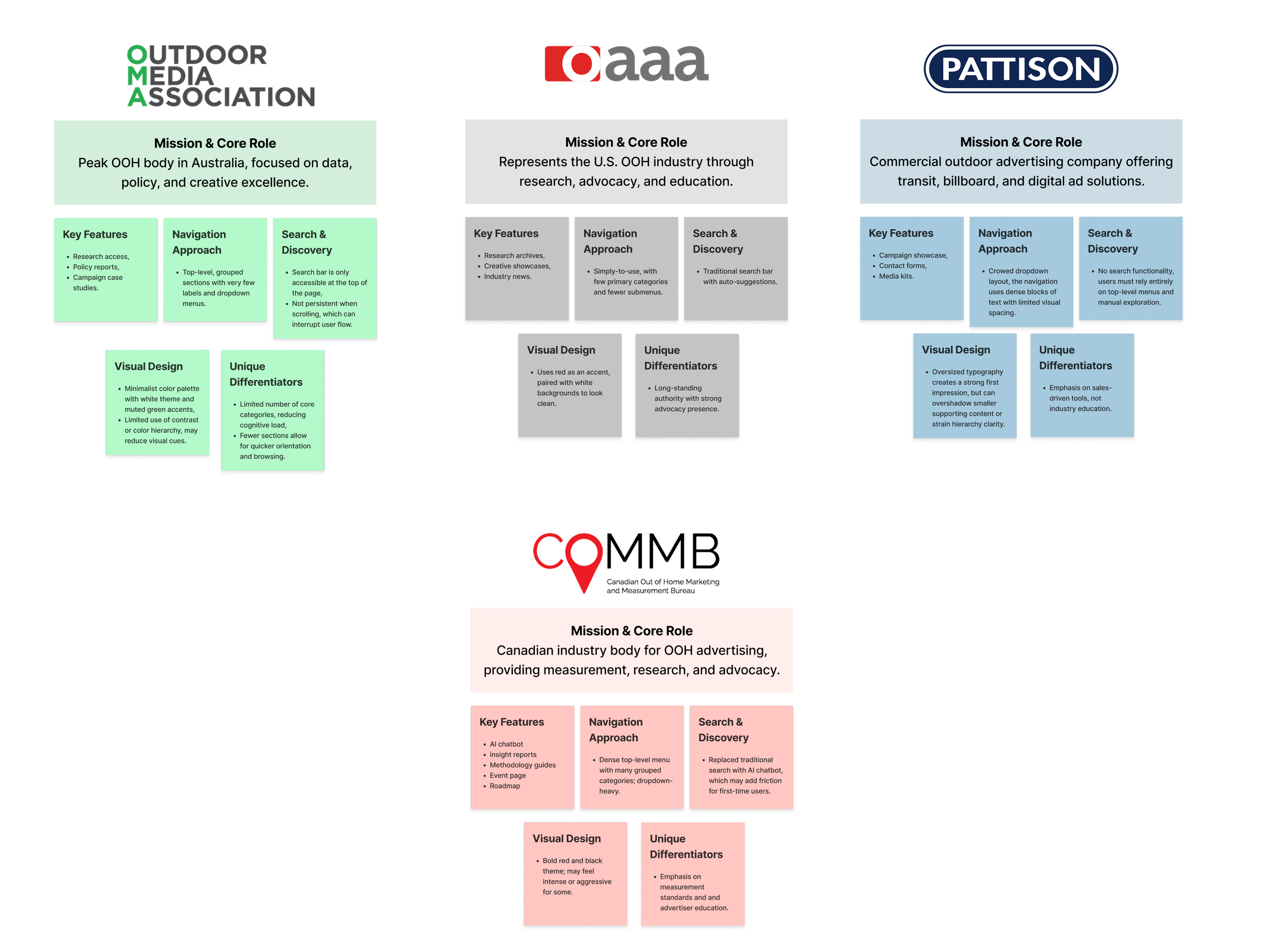
Competitive analysis
To understand how other organizations structure complex industry content, we reviewed three major OOH websites—OAAA (US), OMA (Australia), and Pattison (Canada) to learn what could make COMMB’s site clearer, simpler, and easier to use.
Do users prefer an AI chatbot or a traditional search system, such as a search bar for finding information on the COMMB website?
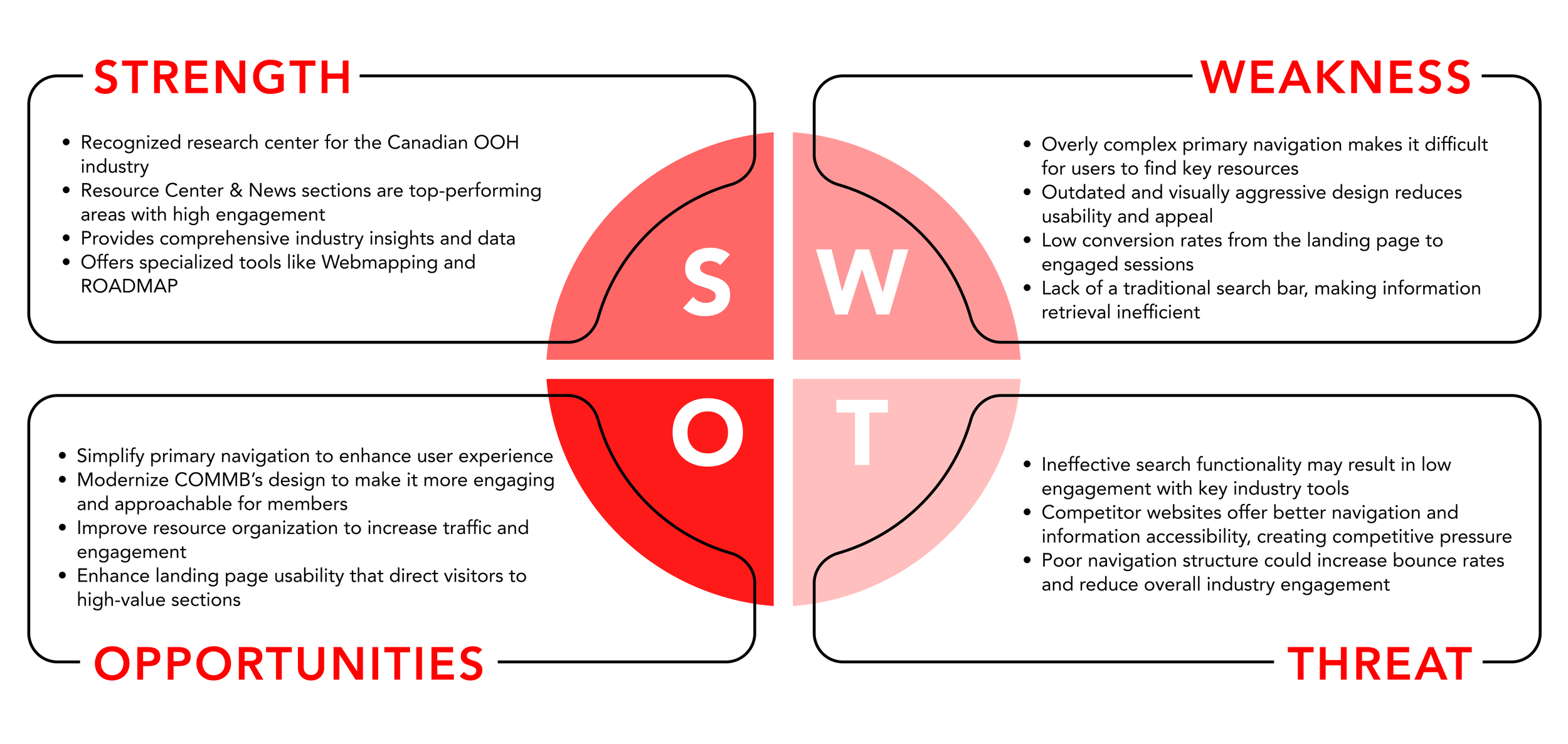
SWOT analysis
We also evaluated COMMB’s current website to understand where its strengths lie, and where redesign efforts would have the most impact.
User Research
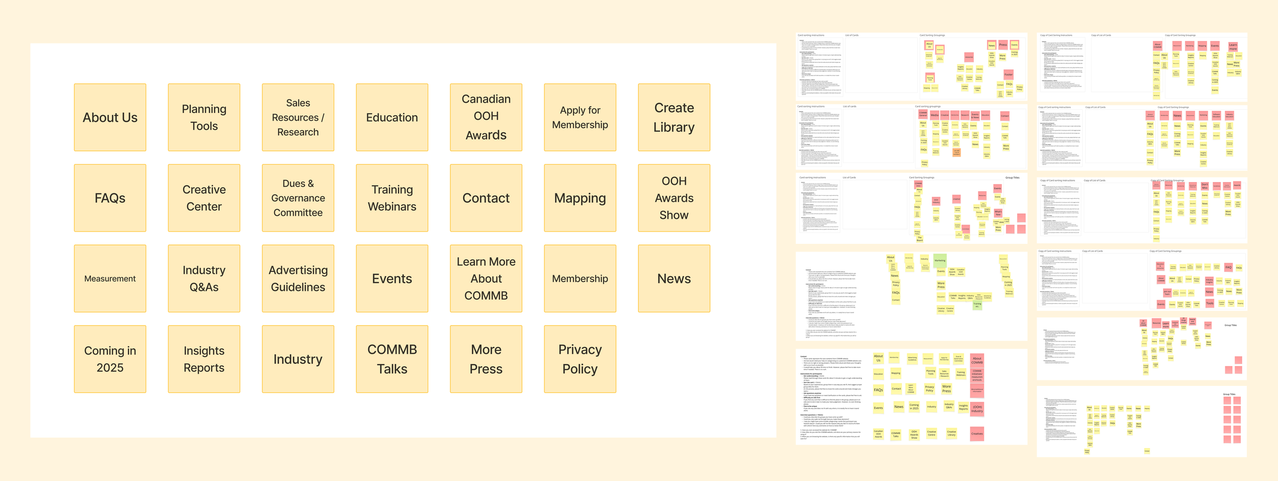
Card Sorting
To evaluate and improve COMMB’s information architecture, we conducted an open card-sorting activity. The goal was to uncover how users naturally group the website’s content and to identify patterns, confusion points, and opportunities for reorganization.
The findings from this activity directly informed our future proposed navigation redesign.
Demographic
11 participants as internal and external professionals in the media, creative, and advertising industries
Timeline
January 29th - February 3rd
Method
The sessions are conducted online using a shared Miro board.
Each session was recorded (with consent) to capture participants’ thinking and comments in real time.
Results were restructured in a spreadsheet, then analyzed using OptimalSort to generate matrices for clustering insights.
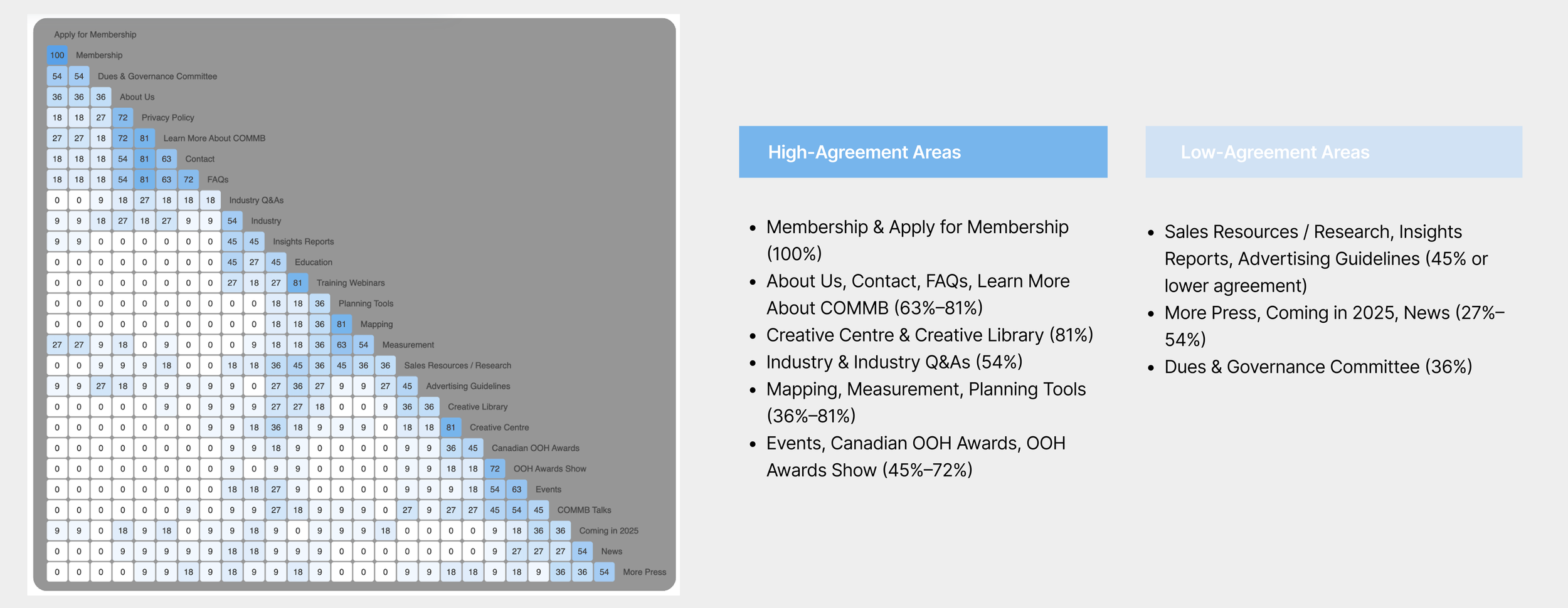
Similarity Matrix
To help us see which items users think belong together the most . The more often two items were grouped together, the higher their similarity score.
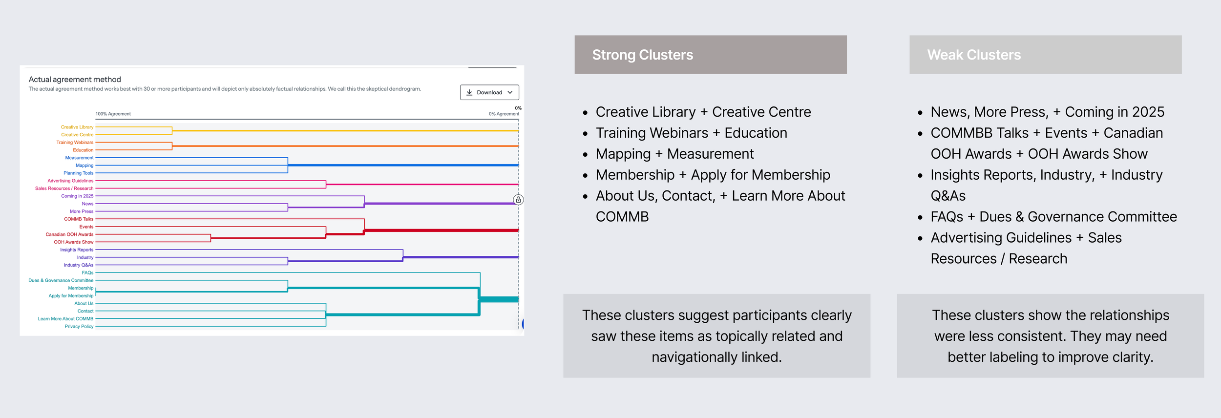
Dendrograms
To help us see natural content clusters and how closely related different items are. However, this method has limitations, primarily the small sample size. It typically yields the best results with 30 or more participants; with fewer, it may fail to capture meaningful patterns. Therefore, we used it mainly to visualize data-driven groupings, rather than to make definitive structural decisions.

Tools Should Be Easier to Reach
Measurement and mapping tools were repeatedly identified as high‑priority content. Users expected these tools to be visible and quickly accessible, indicating a need to surface them more prominently in the navigation.
Search Over Navigation
Most participants relied on search rather than browsing menus to find content. This highlights the importance of a highly visible, trustworthy, and well‑structured search experience.
Result Summary

Low Trust in the AI Chatbot
The chatbot saw minimal engagement. Participants either overlooked it or lacked confidence in its results, suggesting it should be repositioned as a secondary aid or redesigned to better support user needs.

Data Analysis
Define Stage
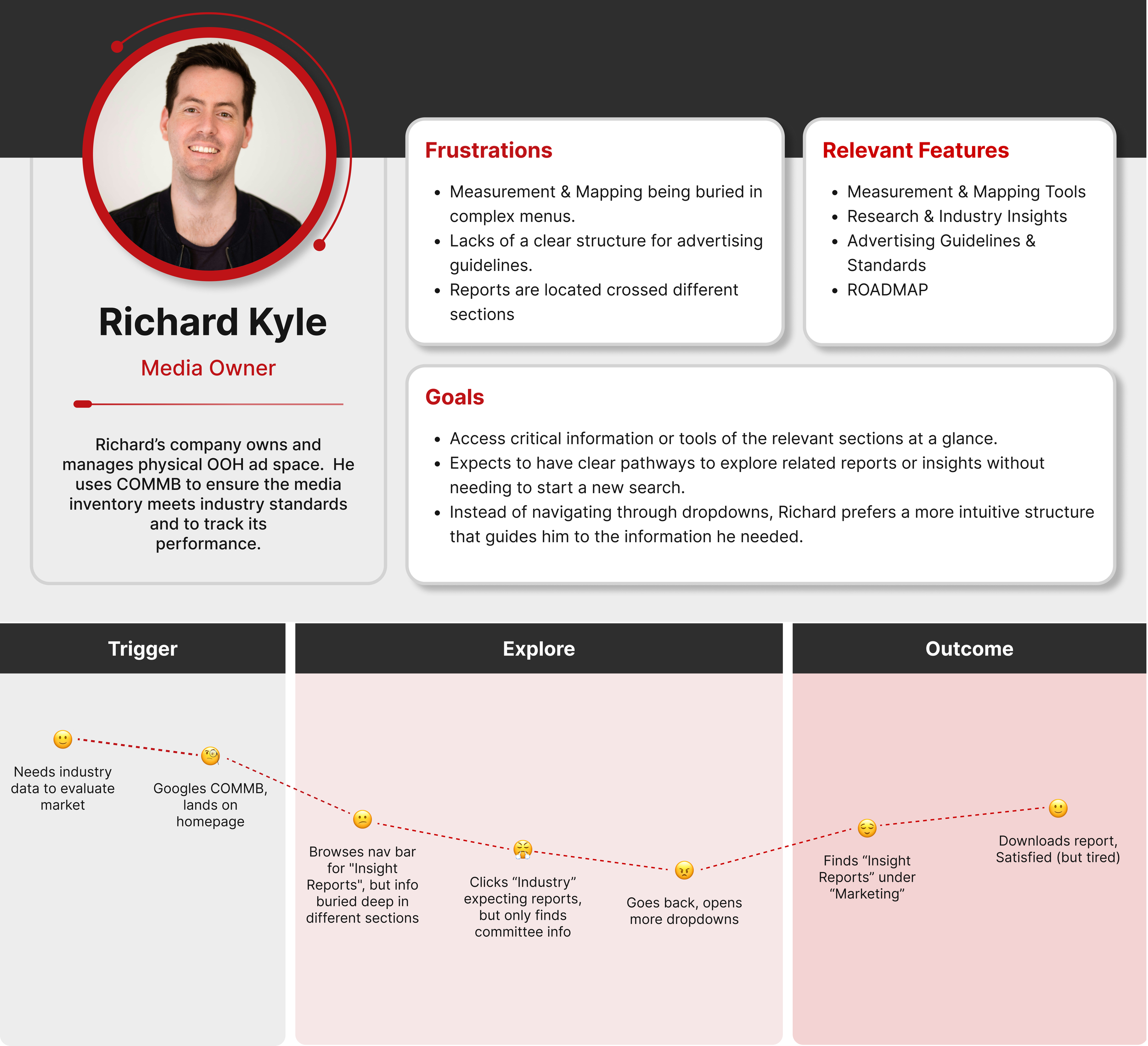
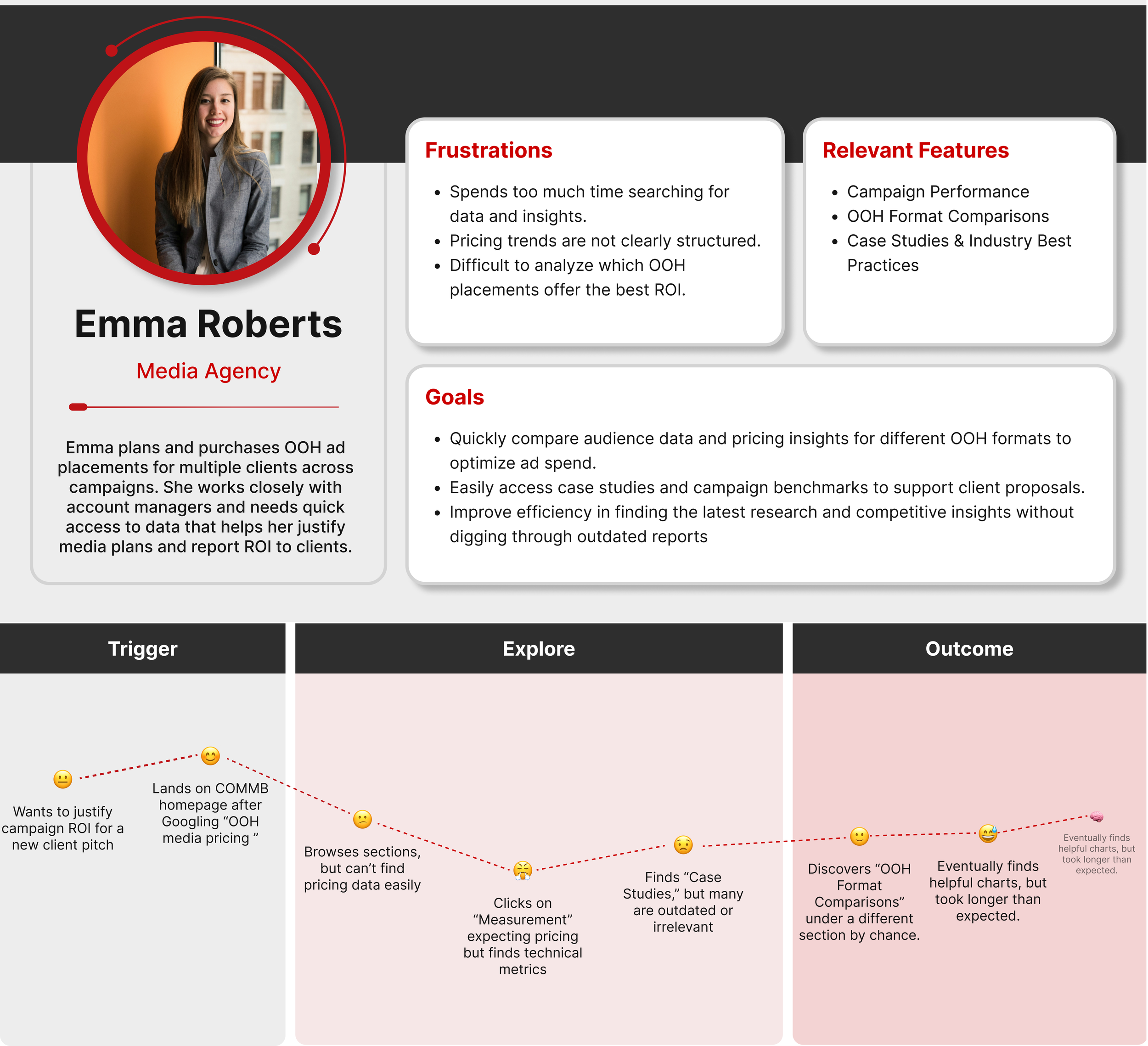
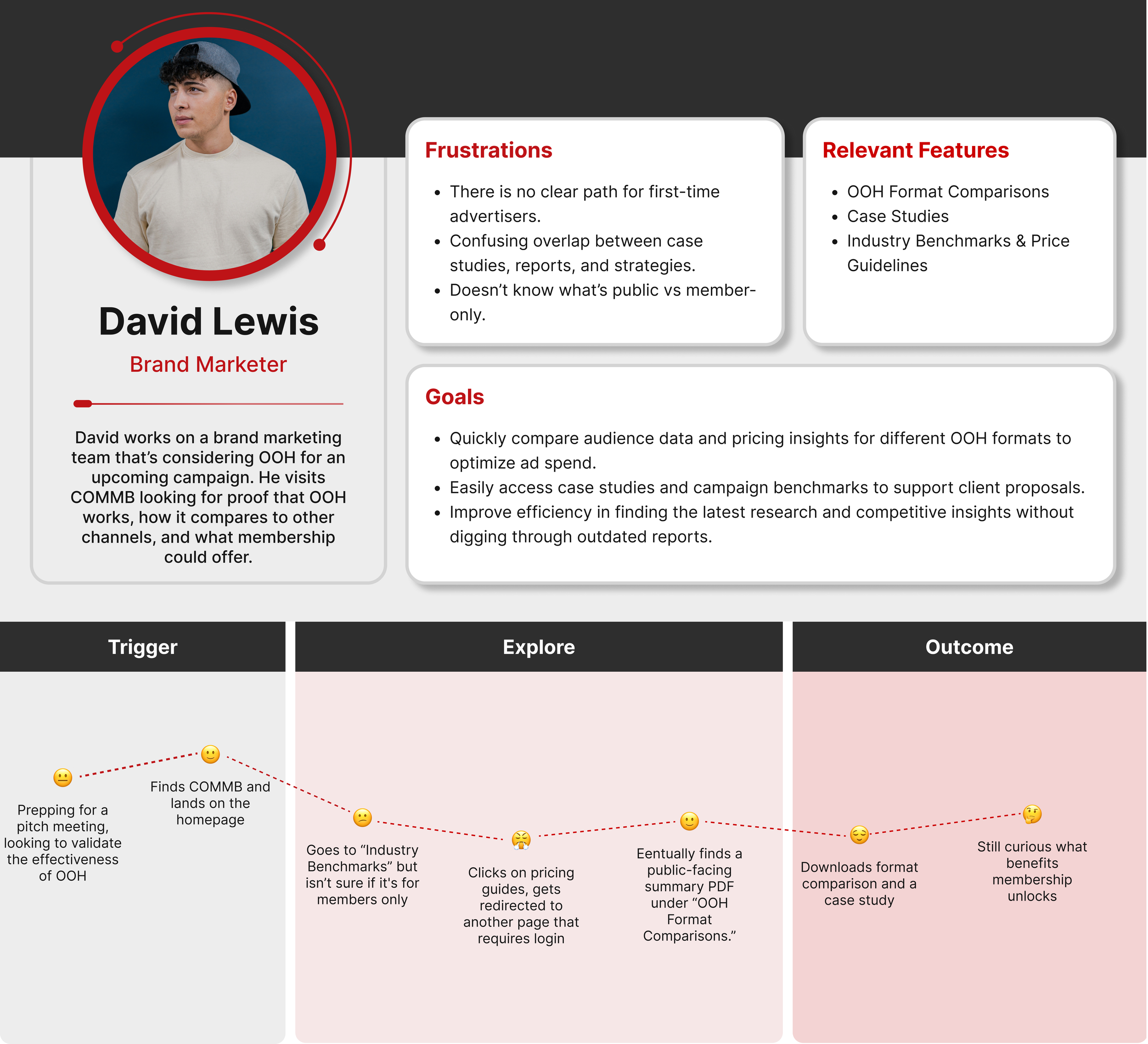
Personas
We synthesized insights from the card sorting activity and stakeholder input to create three personas. These represent COMMB’s primary user groups and helped guide our IA and design decisions with real-world context and goals in mind.
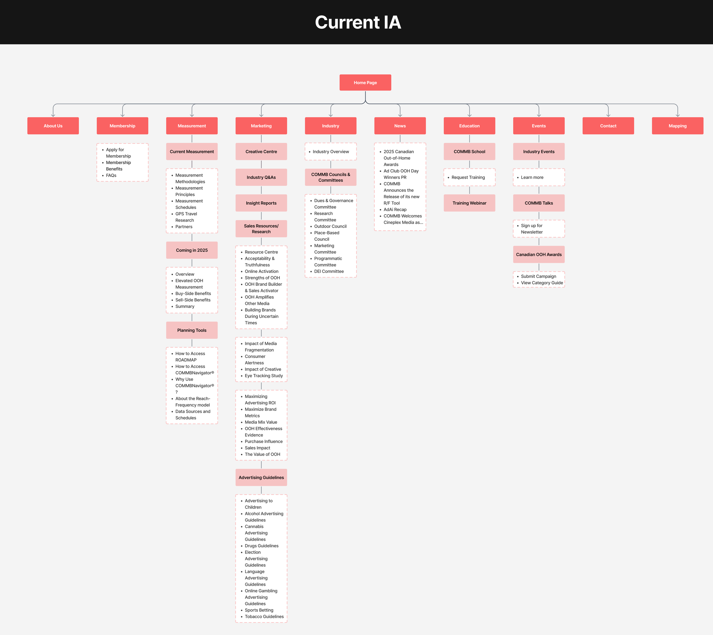
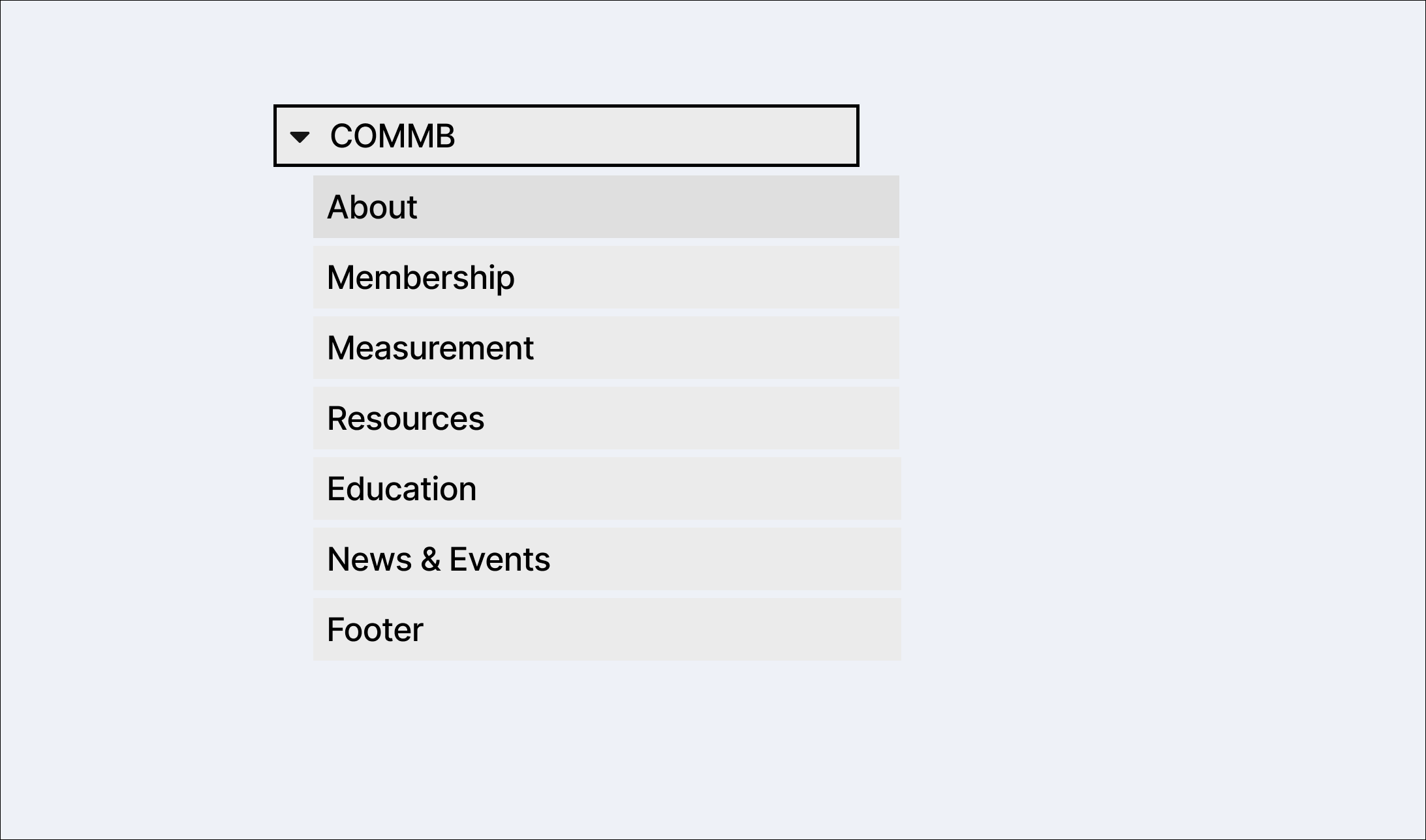
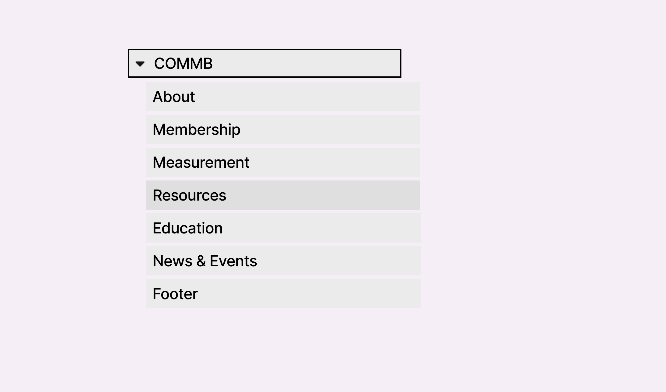
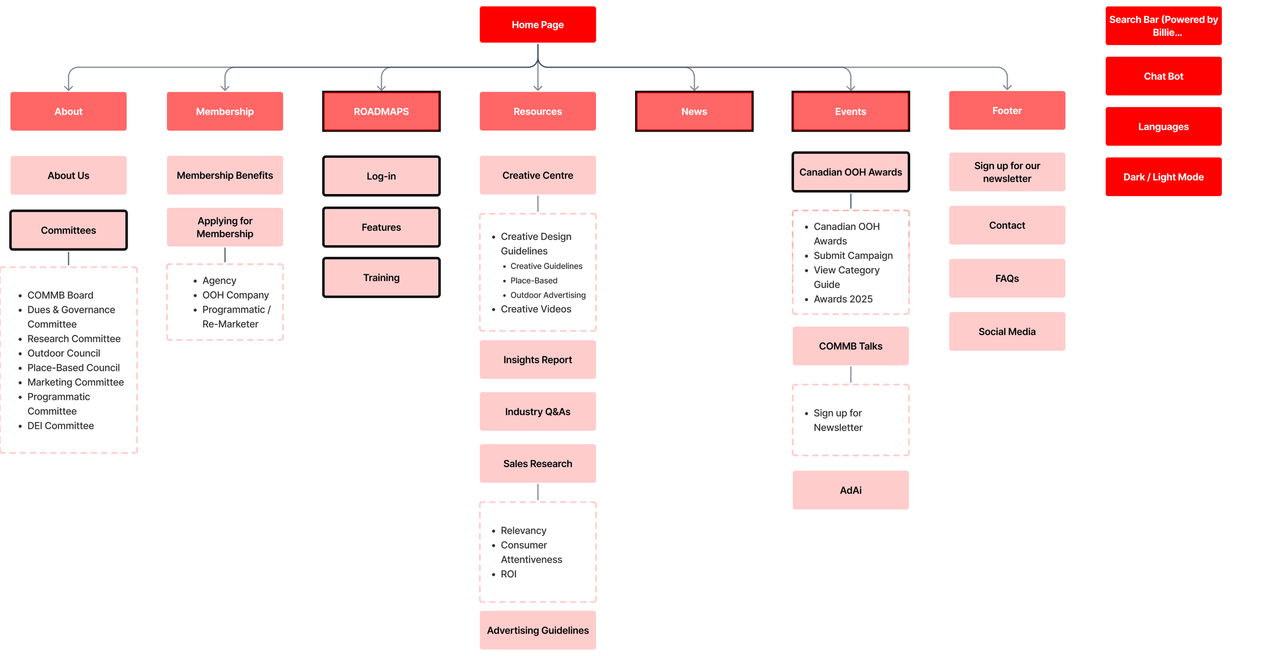
We mapped out the current IA to identify gaps from a user perspective. We also reorganized the structure to surface key content more intuitively, using insights from user research and personas
1.
Based on what we learned from the research, this phase was all about building a structure that fits how users think and navigate.
Information architecture
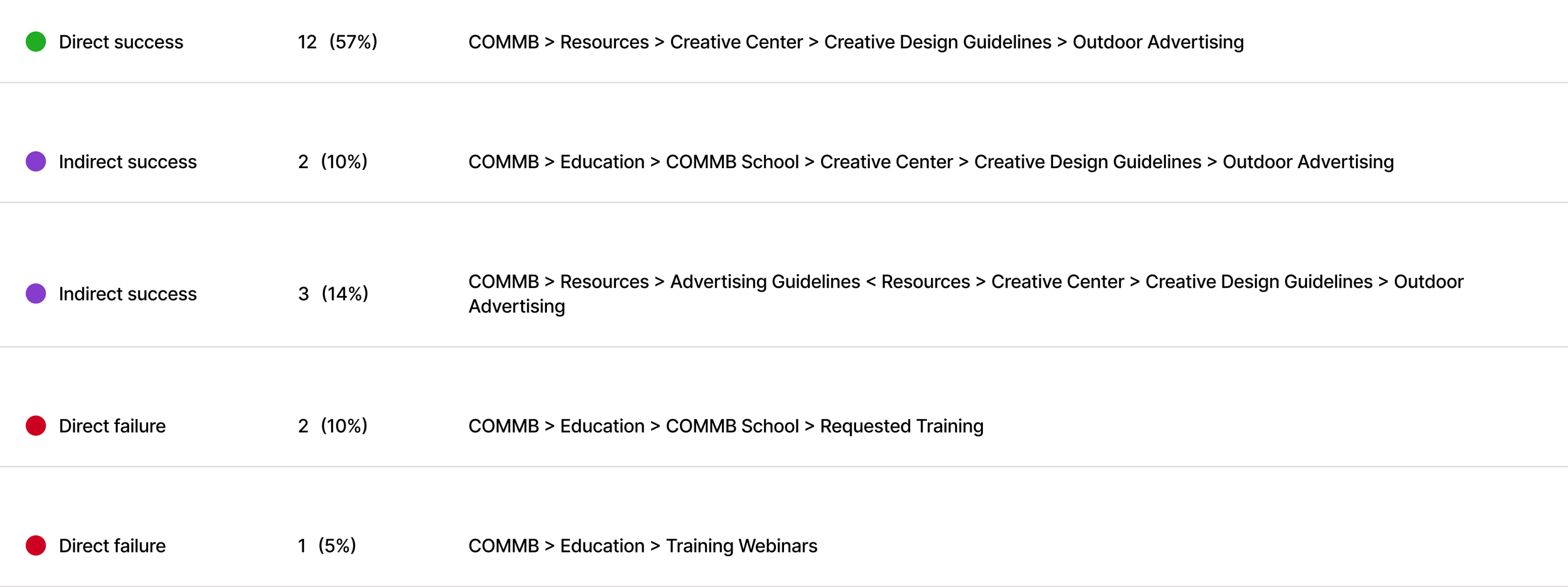
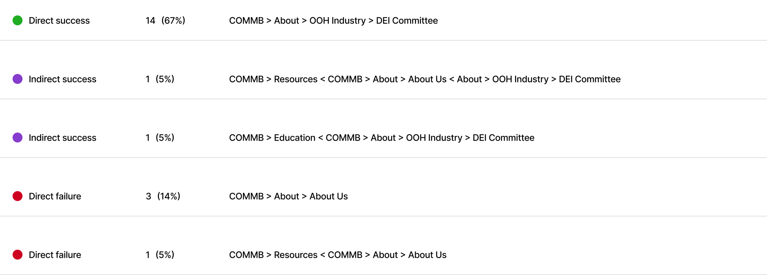
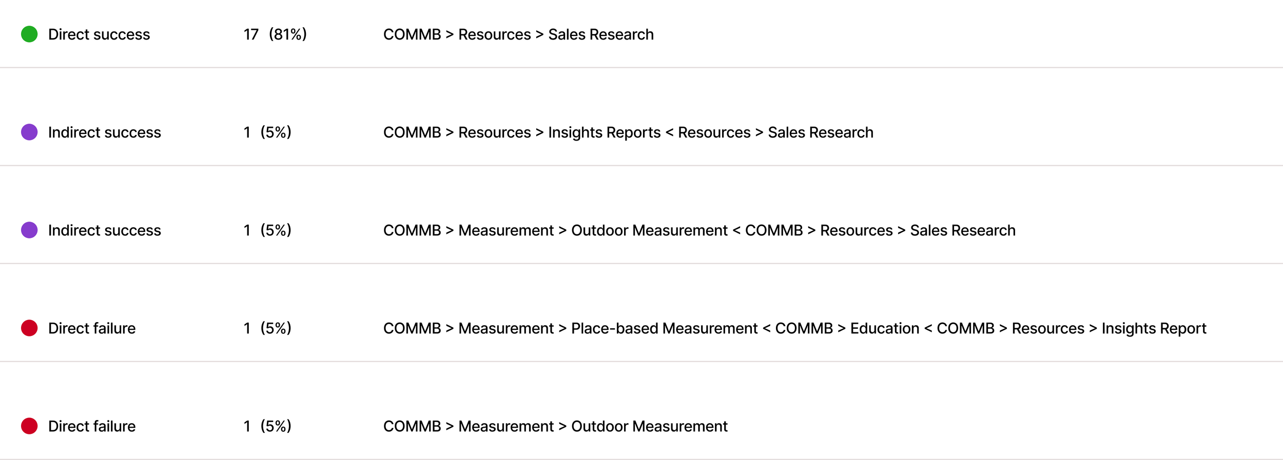
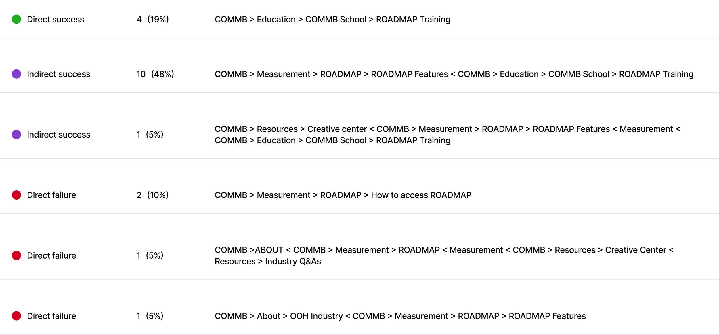
We tested the updated structure through a 20-participant tree test to ensure users could easily locate key resources.
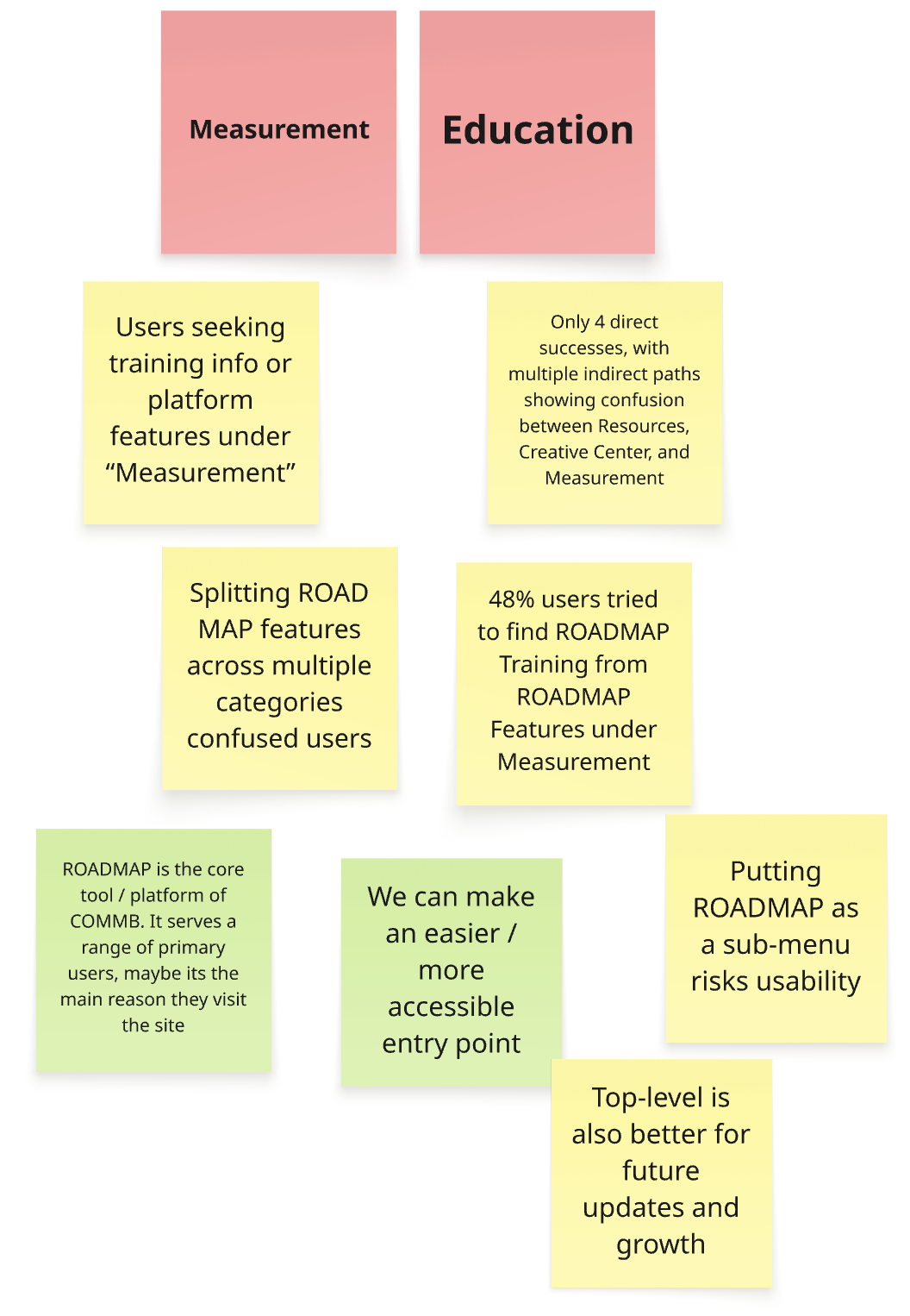
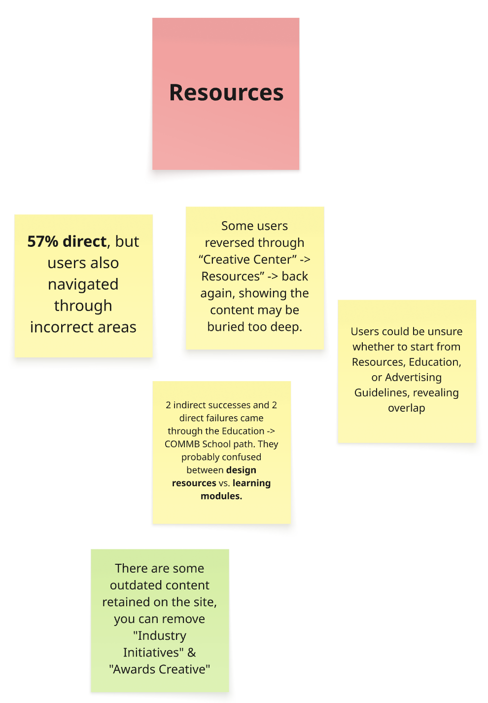
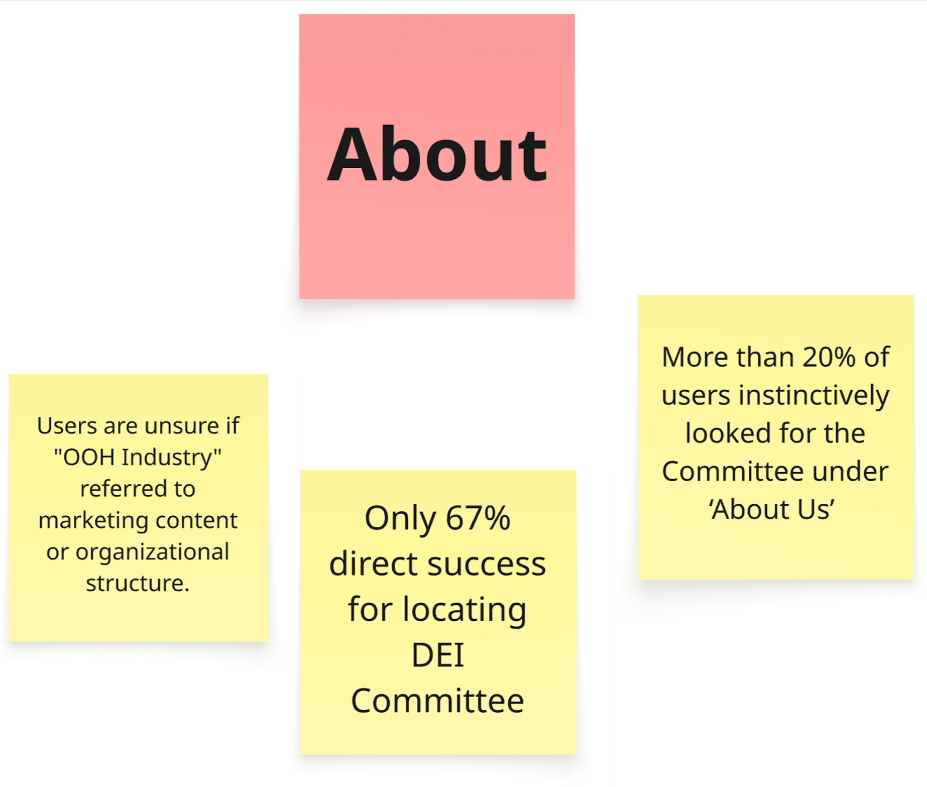
Creative Design Guidelines are a valuable resource for advertisers and creative professionals. However, the content is buried within a deeper navigation structure. This scenario tests whether users can still locate it effectively.
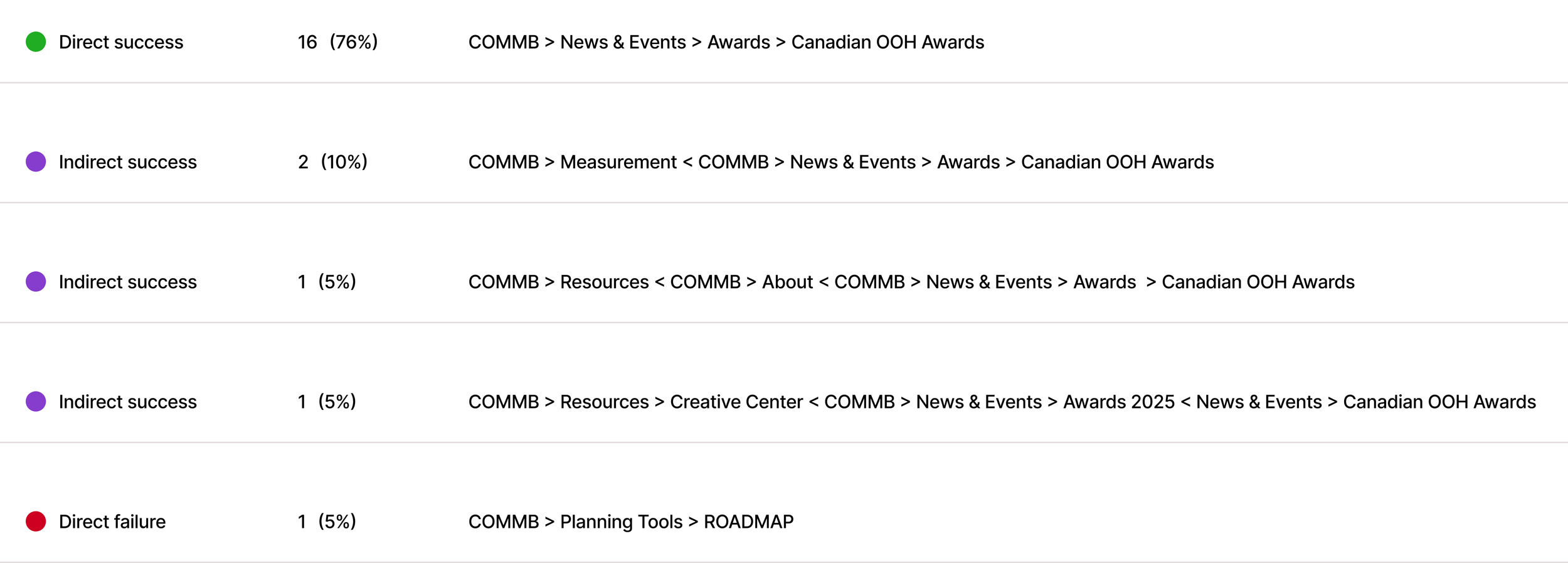
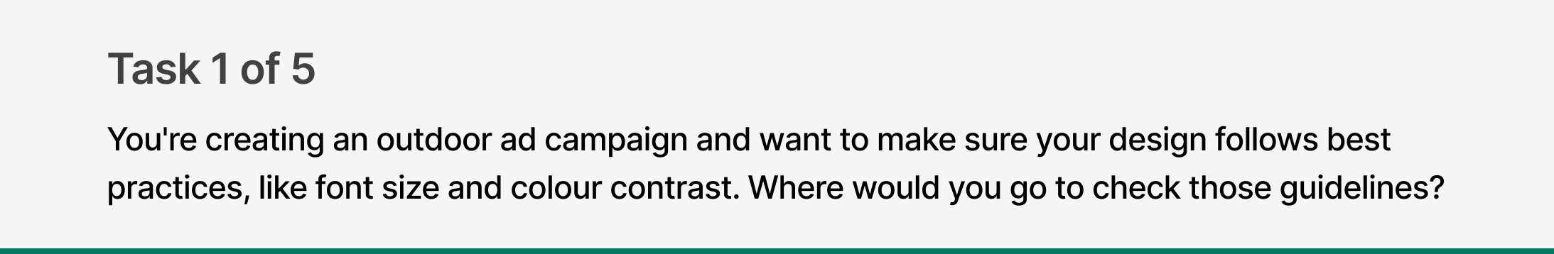
Tree testing
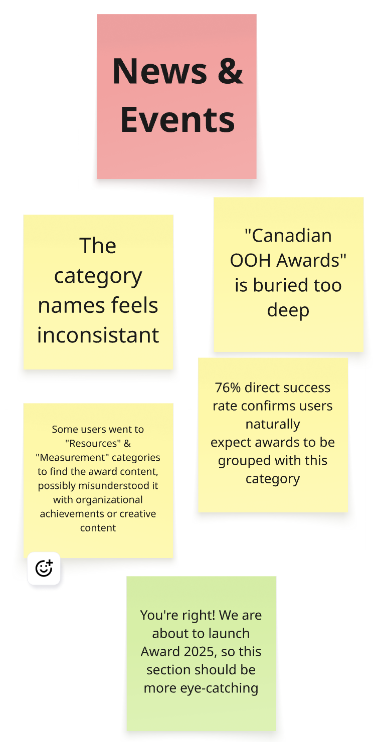
This question simulates a common industry task and evaluates whether users naturally look for ‘Awards’ within the combined navigation category, News & Events.

2.
In the updated IA, we removed the ‘Industry’ category and placed ‘OOH Industry’ under the ‘About’ section. This scenario helps test whether that shift still aligns with returning users’ expectations.

3.
Sections under Resources are mostly data and report driven, with Sales Research being a key destination. This scenario helps assess whether users can distinguish between the different types of content and efficiently locate relevant audience data reports.”pectations.
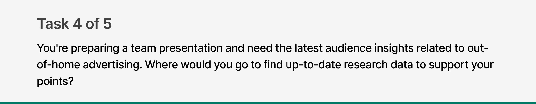
4.
Sections under Resources are mostly data and report driven, with Sales Research being a key destination. This scenario helps assess whether users can distinguish between the different types of content and efficiently locate relevant audience data reports.”pectations.
5.
After collecting the data from the tree testing, we reviewed and created a summary list in collaboration with the stakeholders
Result Summary

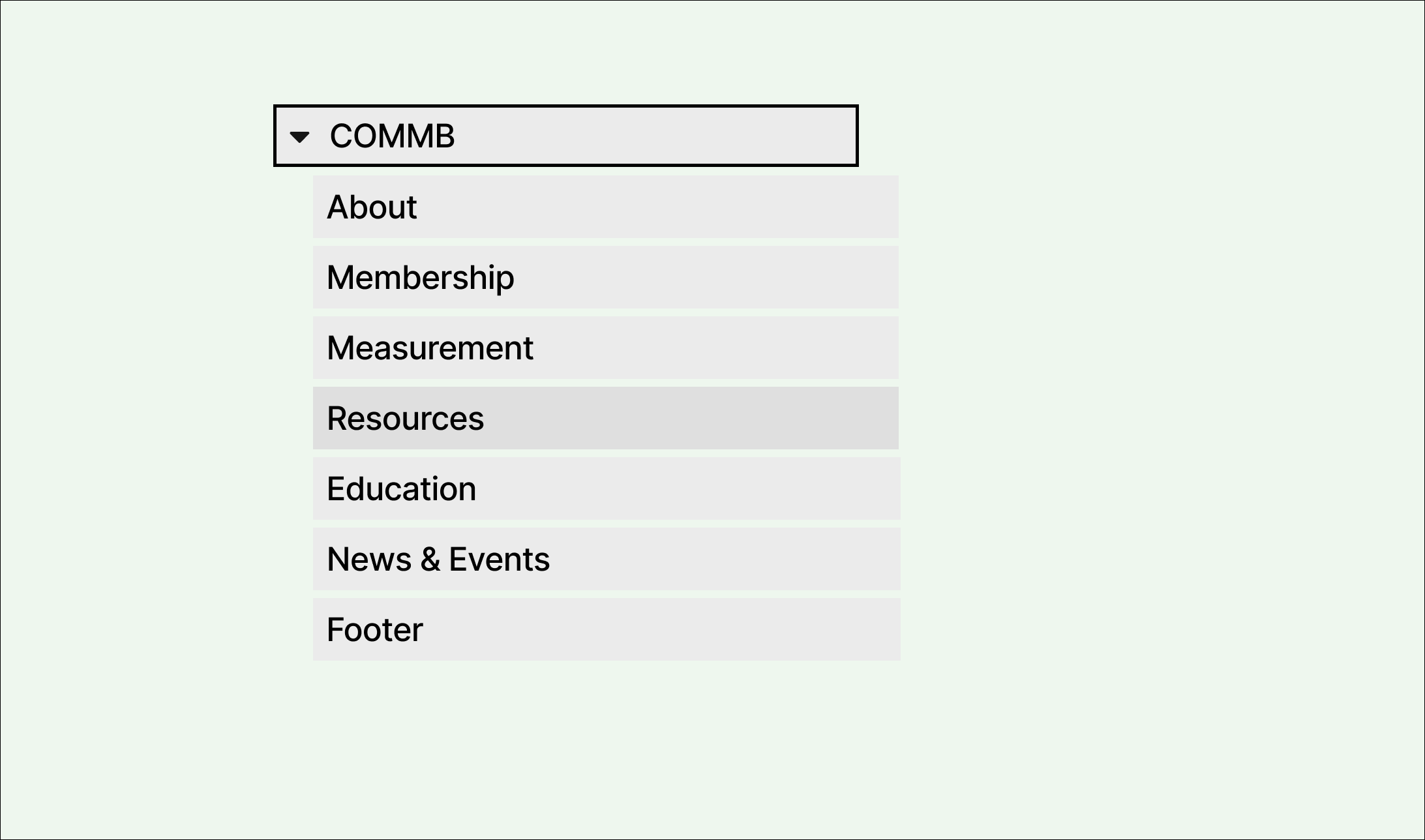
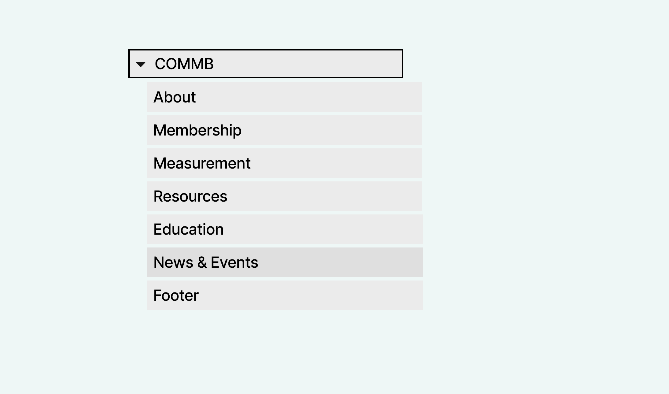
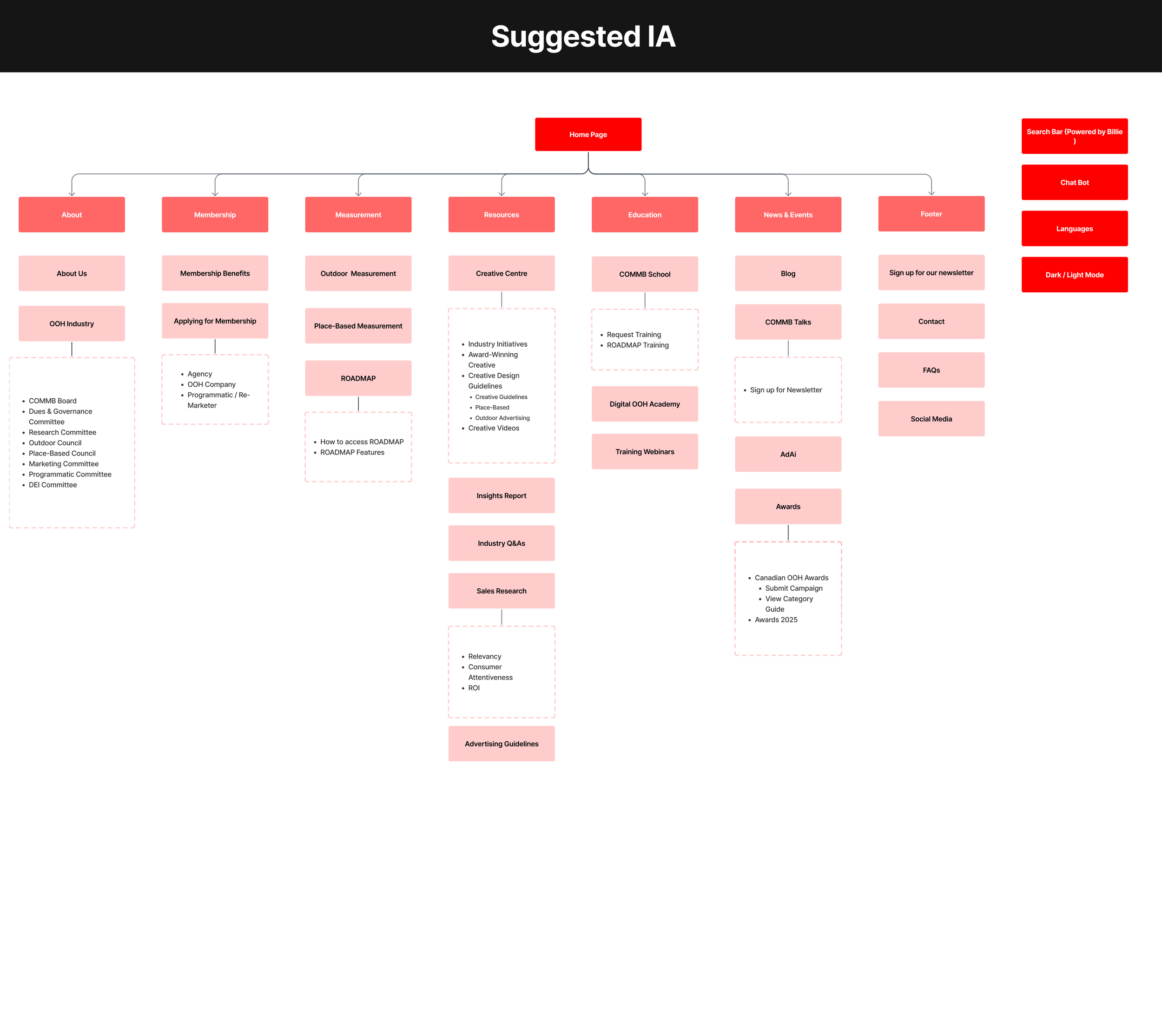
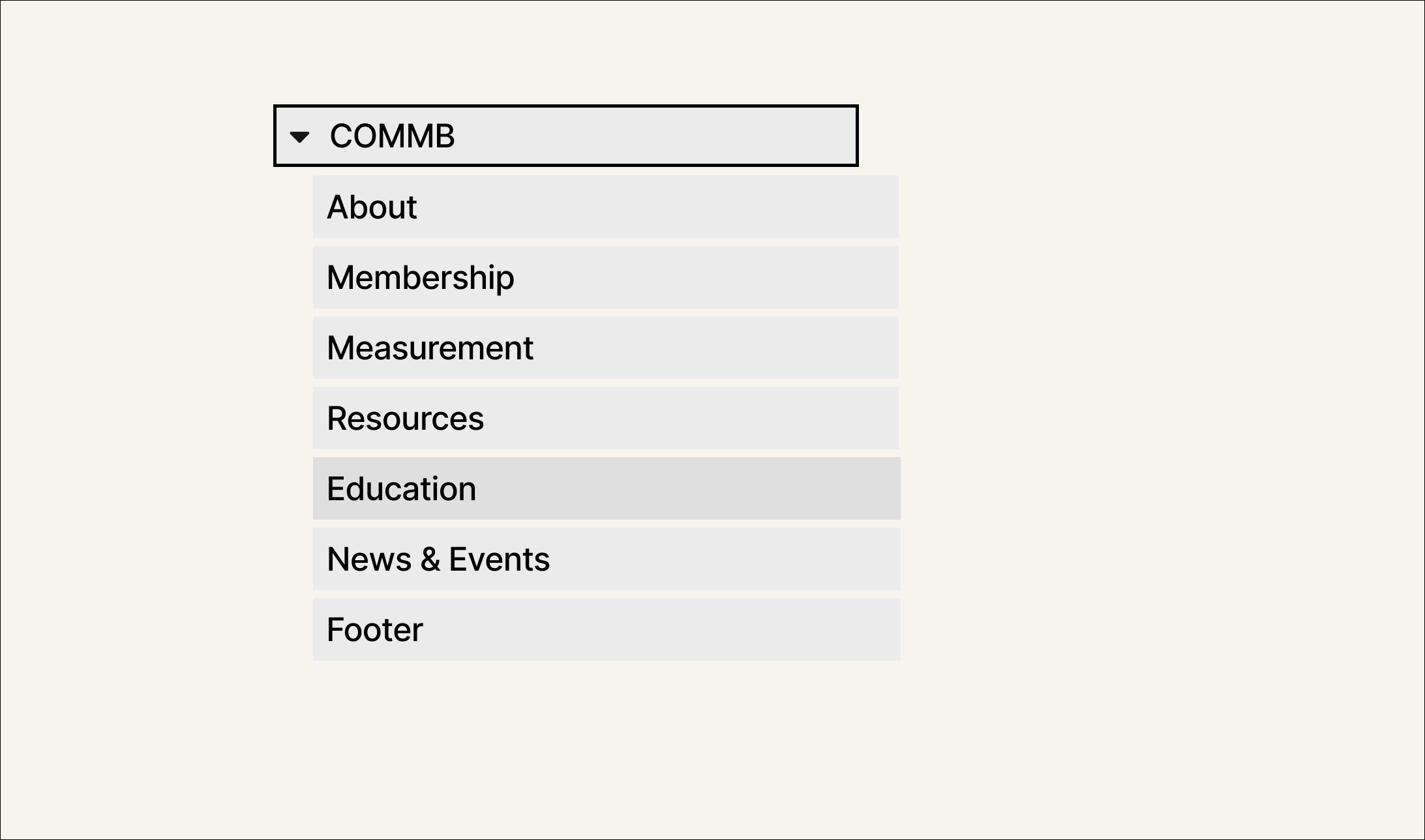
Based on the key findings, we restructured the site’s navigation to improve overall clarity and accessibility
Revised Information Architecture
Prototyping Stage
With the structure in place, we shifted focus to the visual experience. This stage translate strategy into design through systematized UI, prototyping, and hands-on iteration.
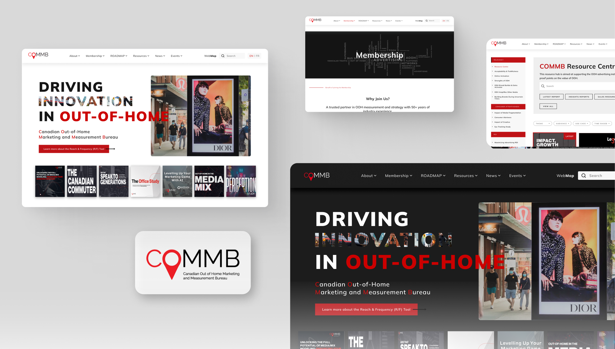
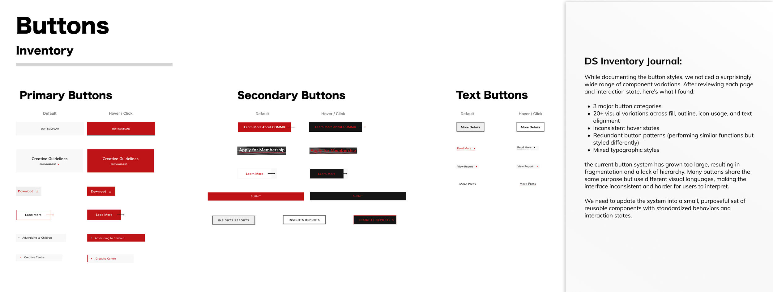
Design System Inventory
COMMB didn’t have an existing design system to build on, so we began with a full inventory of current components.
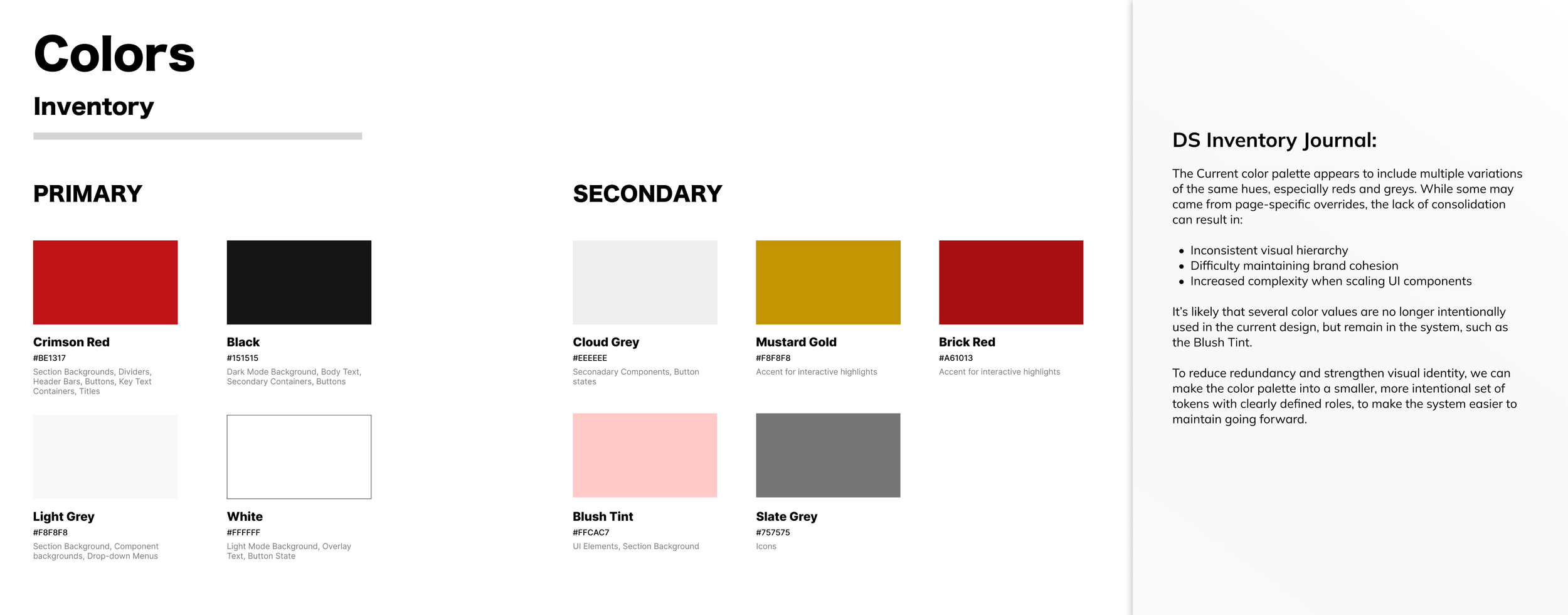
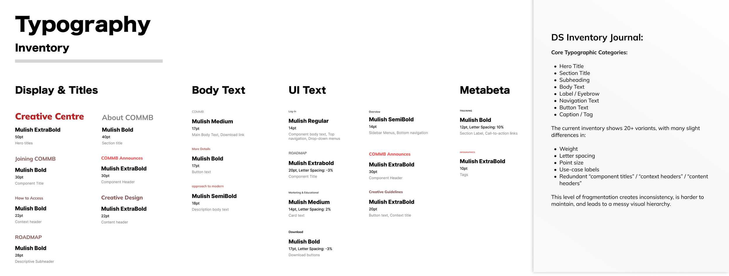
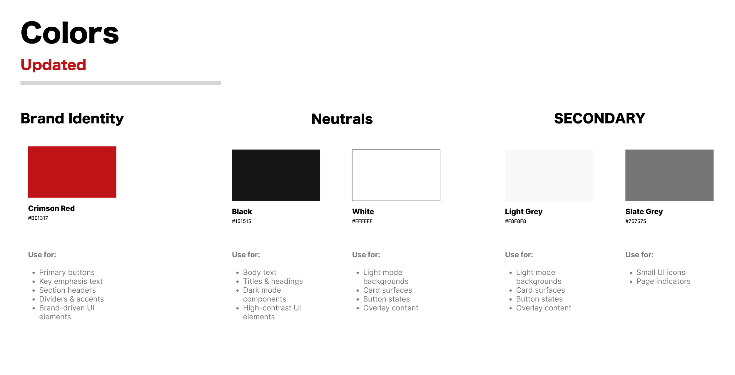
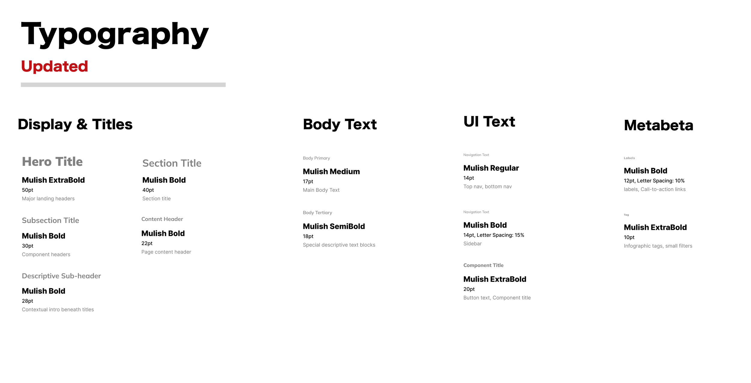
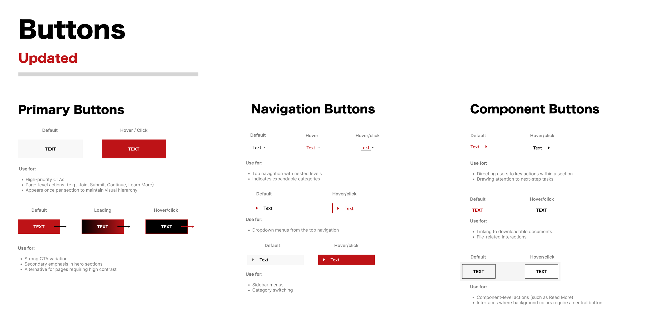
Design System Updates
As a marketing platform, we aimed to keep the visual style familiar while making things clearer for a wide range of users. Instead of adding more, we focused on cleaning up what was already there and tightening up the overall look and feel.
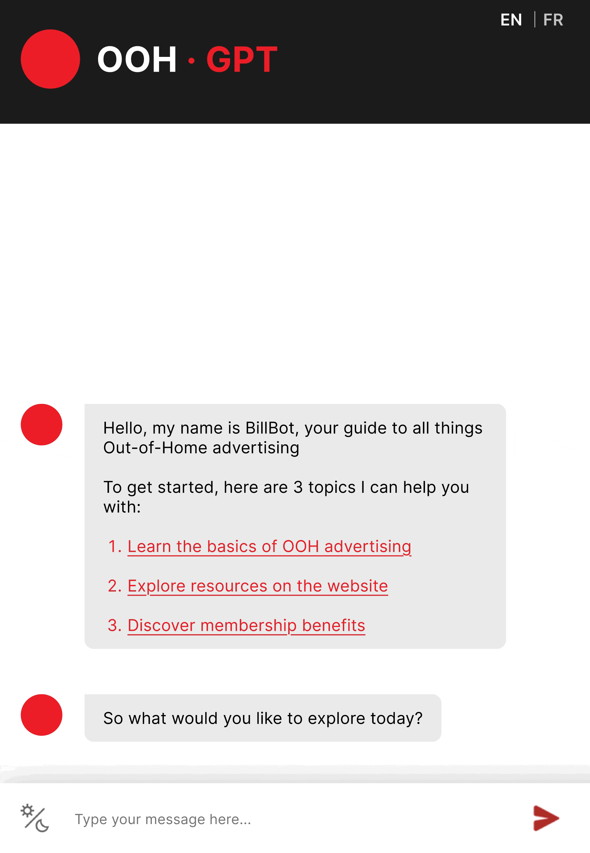
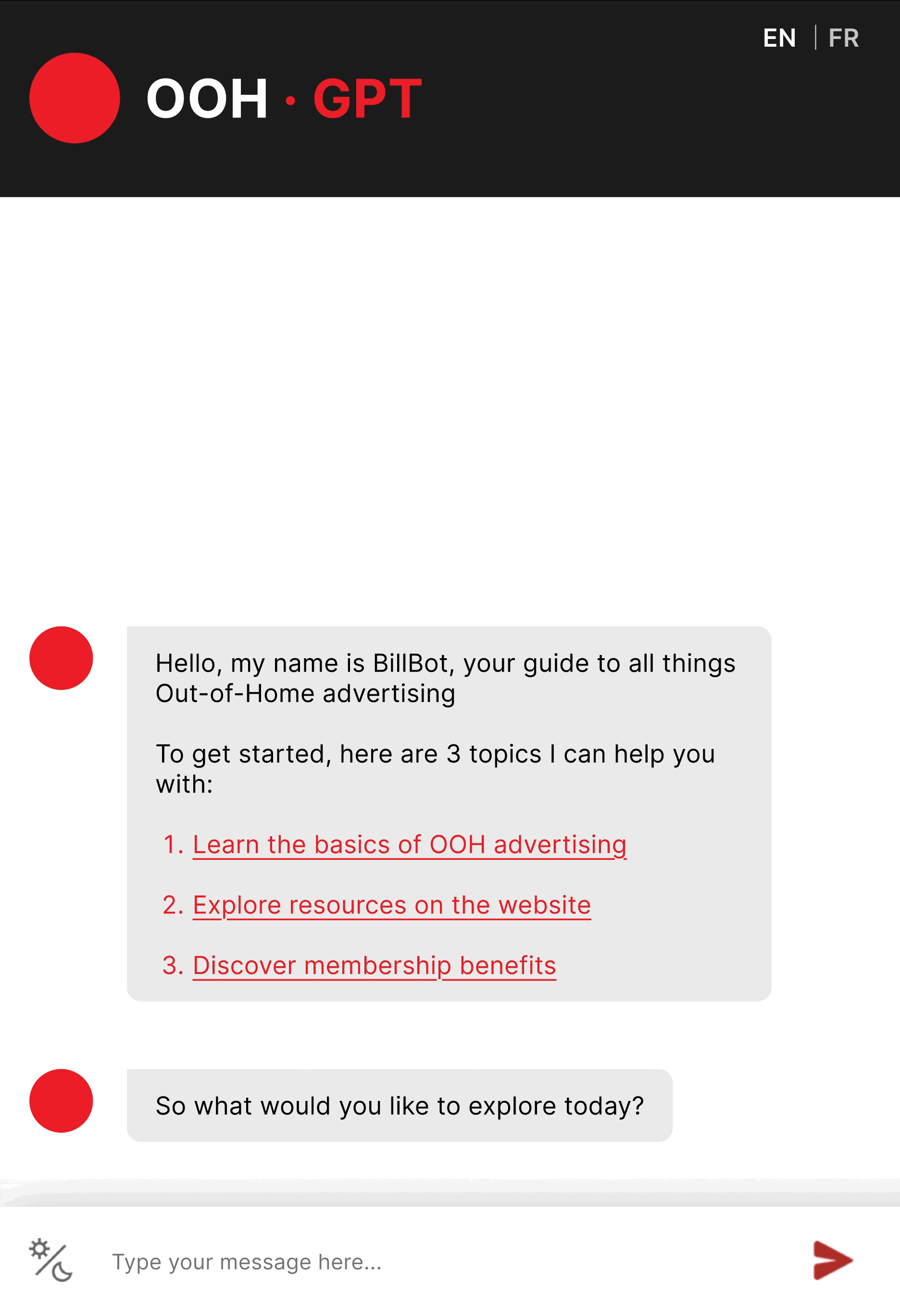
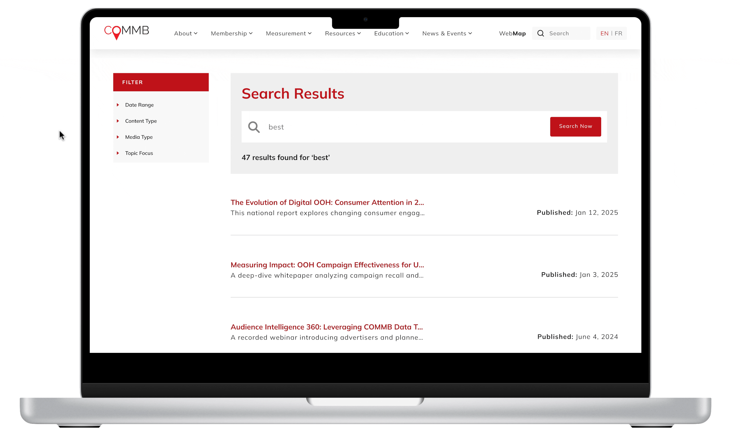
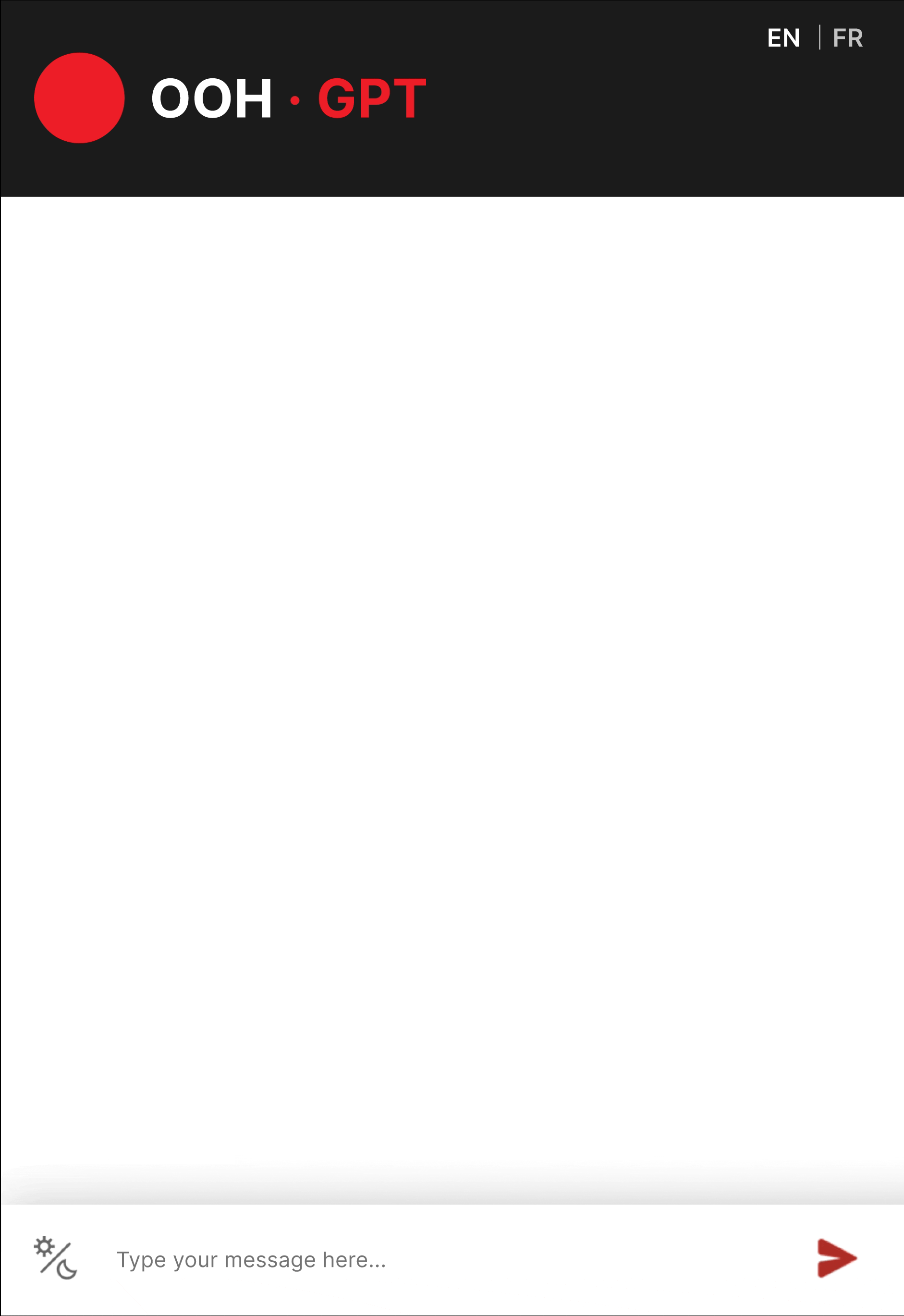
Search Experience Prototype
Search Bar
To simplify how users find the right information, we introduced a new search bar and redesigned OOH-GPT (the AI chatbot). These updates work together to help users locate key resources faster, build trust, and gain a stronger sense of control when navigating COMMB.
Quickly locate the right content
Instead of browsing through pages, users can now type in keywords like "OOH trends" or "rate cards" to instantly access the most relevant resources.
Filter by relevance, date, or format
To better serve users with specific needs—like agencies looking for older case studies or clients searching by location—we added advanced filters. These options help tailor results and make the search experience more targeted and efficient.
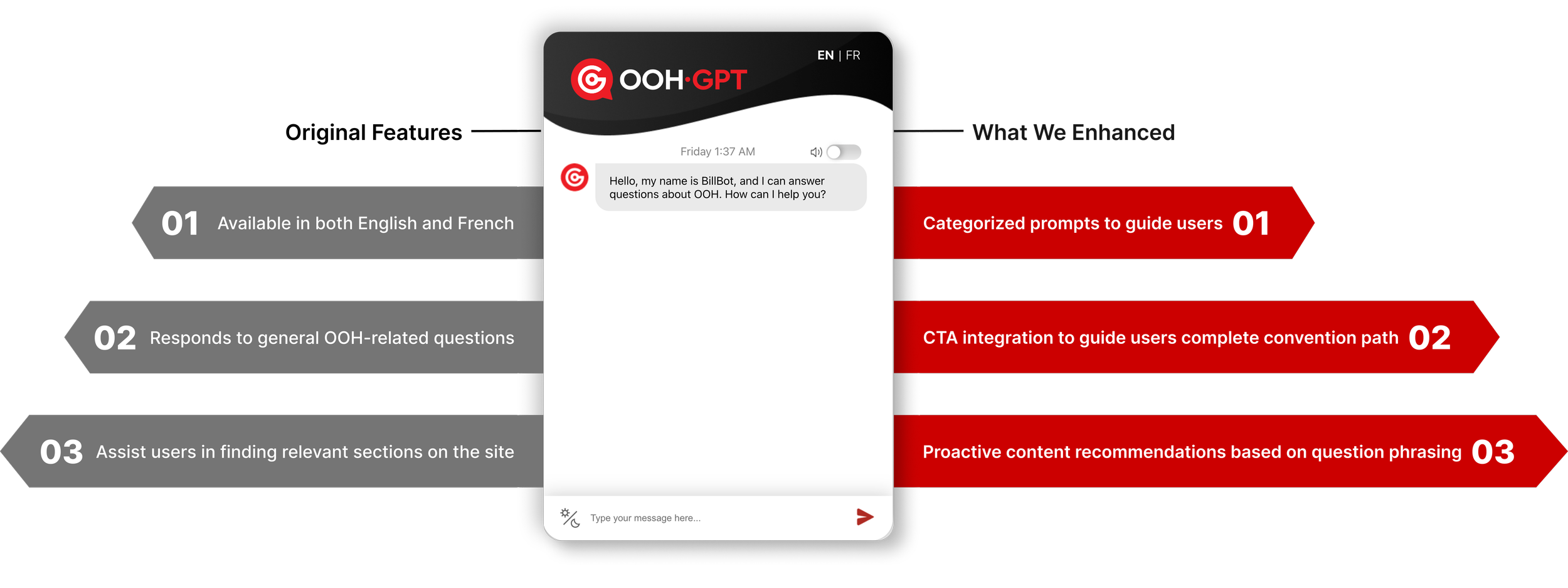
The original version of OOH-GPT was designed as an informational assistant to educate primary users of COMMB about the OOH advertising space. It answered common questions, such as definitions, formats, targeting methods, and measurement best practices, and helped users navigate to relevant resources on the COMMB website.
We saw a business opportunity to enhance OOH-GPT into an educational copilot for COMMB, as today’s value of AI extends beyond delivering content, but to understanding context and responding accordingly.
The new OOH-GPT is designed not as an alternative to the new search bar, but as its complement. While the search bar enables fast, direct lookup, OOH-GPT focuses on guidance,
By responding to how questions are asked, not just what is asked, OOH-GPT can surface the right content at the right moment and build trust through conversation.
Together, search and OOH-GPT create a more supportive, confidence-building experience that strengthens users’ intent to engage, and eventually convert with COMMB.
Conversation Flow Chart
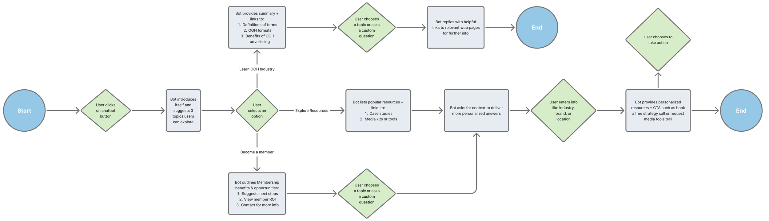
Path 1: Learn the basics of OOH advertising
Designed for first-time and non-expert users, this path positions OOH‑GPT as a personal OOH reference.
Rather than just pointing users to pages, the chatbot explains core concepts in plain language that users can rely on throughout their work, not just while browsing the COMMB site.


Path 2: Explore resources on the website
Because web content is often structured and uniform, this path highlights where a chatbot adds the most value: strategic guidance.
OOH‑GPT uses question phrasing and context to surface the most relevant COMMB resources, positioning itself as an industry insider that helps users understand what to read, why it matters, and where the data comes from.


Path 3: Discover membership benefits
Between discovering COMMB membership and submitting an application, users often need reassurance and clarity.
In this path, OOH‑GPT supports the conversion journey by reinforcing value, answering objections, and guiding next steps, acting as a conversational extension of the sales team rather than a replacement.