Project Overview
The group project focused on innovating traditional pedal-assist e-bikes (PAEB) to better meet the needs of today's digital users. By analyzing the advantages and disadvantages of existing PAEBs, our team identified key areas for enhancement, aiming to create a more user-centric and technologically advanced e-bike brand.
TimeLine
10.6.2022 - 12.10.2022
Team Members
Jiewen Li · Yunhan Liu · Linyi Li · Jingyi Jia · David Choi
Tools
Figma · Miro · Procreate · Blender

Background
Pedal-assist e-bikes have gained significant popularity worldwide, offering a sustainable and efficient alternative to conventional transportation. Despite their benefits, there remain opportunities for improvement to cater to modern digital users' demands. This project seeks to address these gaps by integrating innovative features and functionalities into the e-bike design.
Problem Statement
Power-assisted e-bikes (PAEBs) pose unique safety challenges, including higher crash severity, and risky riding behaviors. Moreover, PAEB riders often misjudge speed, especially at intersections, leading to traffic hazards. These issues highlight the urgent need for smarter, safety-focused design solutions.
Target
Hi-Bike is built for people who value sustainability, convenience, and cutting-edge technology. By focusing on their specific needs, such as efficient navigation and digital integration, we're creating an e-bike that fits perfectly into their fast-paced, modern lifestyles.
Survey Results
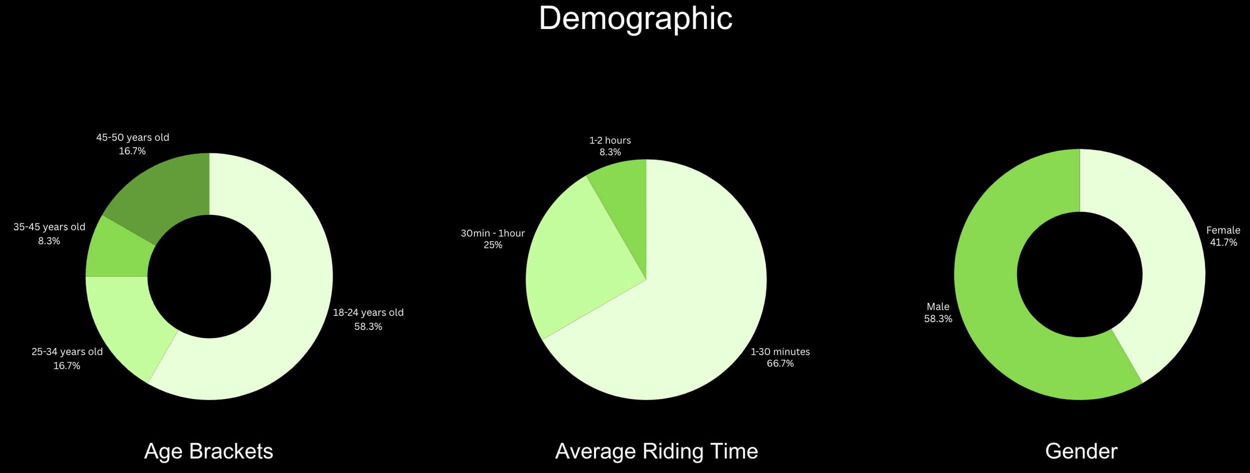
At the start of our design process, we conducted an online user survey with 12 participants who have experienced owning or riding a pedal-assist e-bike (PAEB). This survey aimed to help our team empathize with potential users while gathering valuable quantitative data.
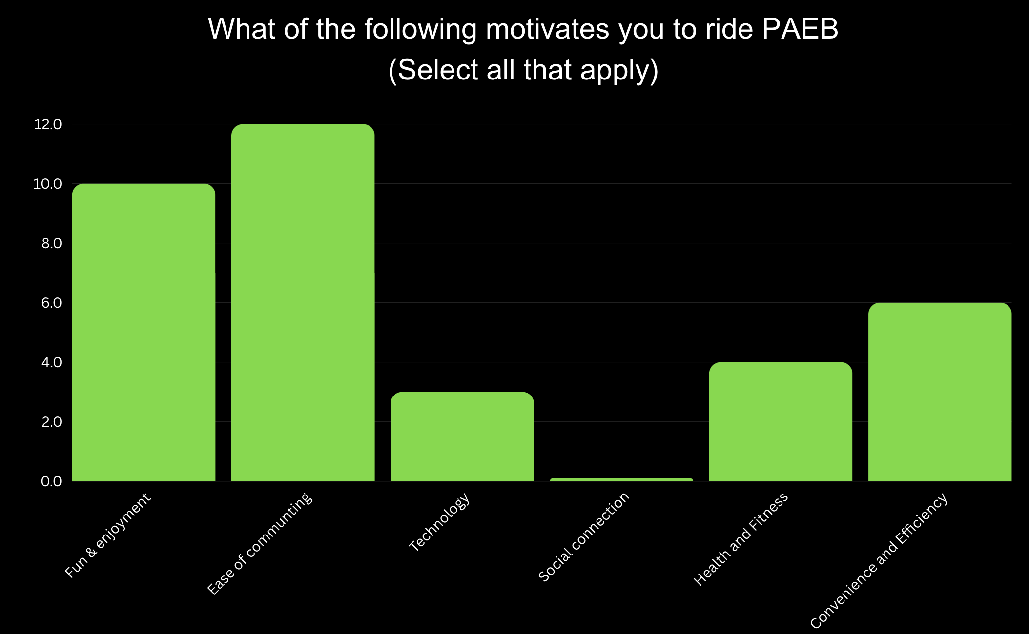
Motivational Factors: Users prioritized "Fun & Enjoyment" and "Ease of Commuting," guiding our focus on designing intuitive, engaging features.
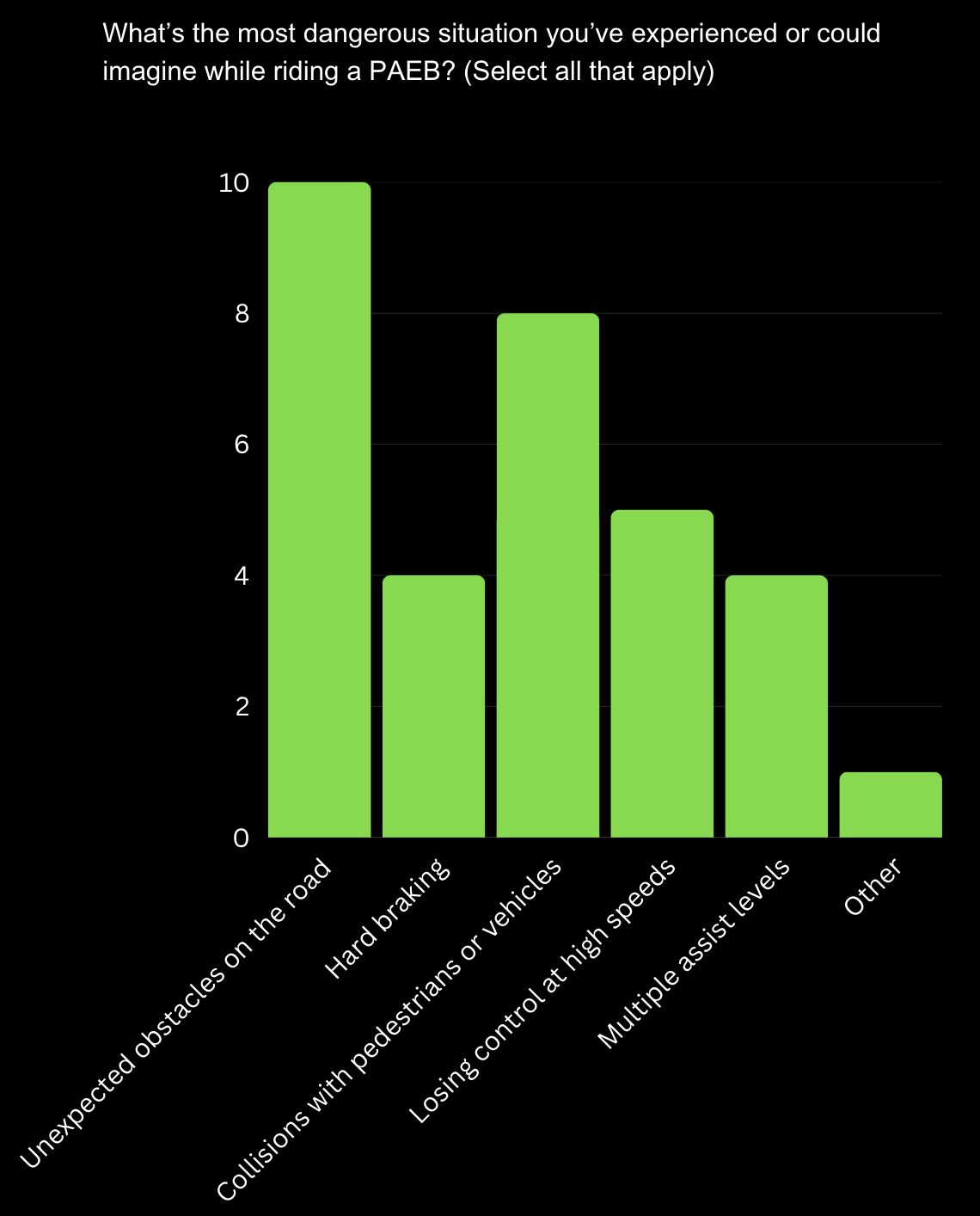
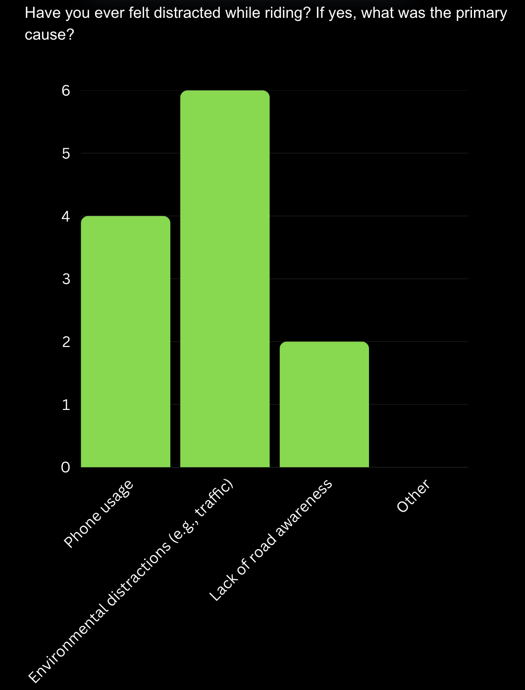
Key Safety Concerns: Users identified "Unexpected obstacles on the road" and "Losing control at high speeds" are the most commonly cited dangerous situations when riding a PAEB. This suggests a strong need for enhanced safety features to address users' primary concerns.
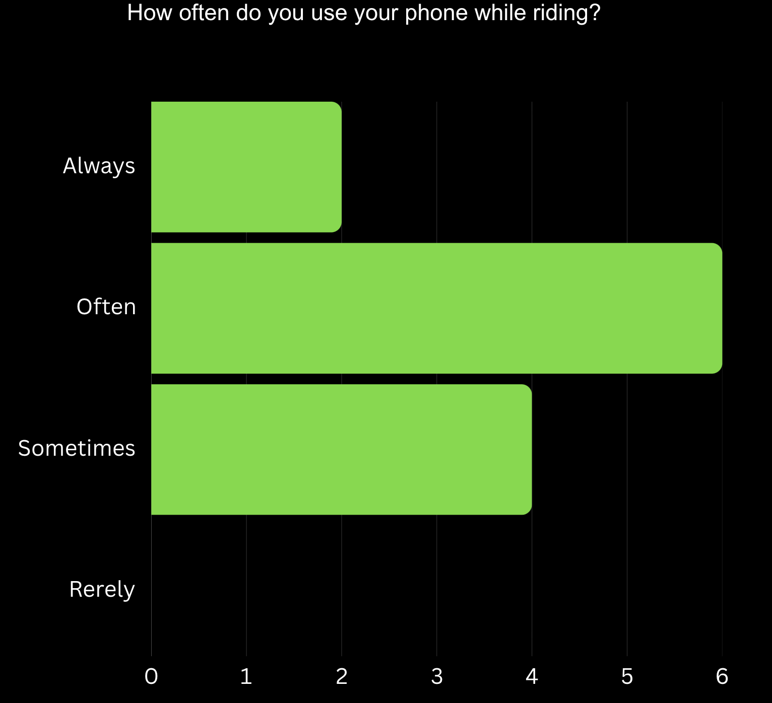
Distraction Issues: Users reported that the main sources of distraction are phone usage and external factors like traffic.
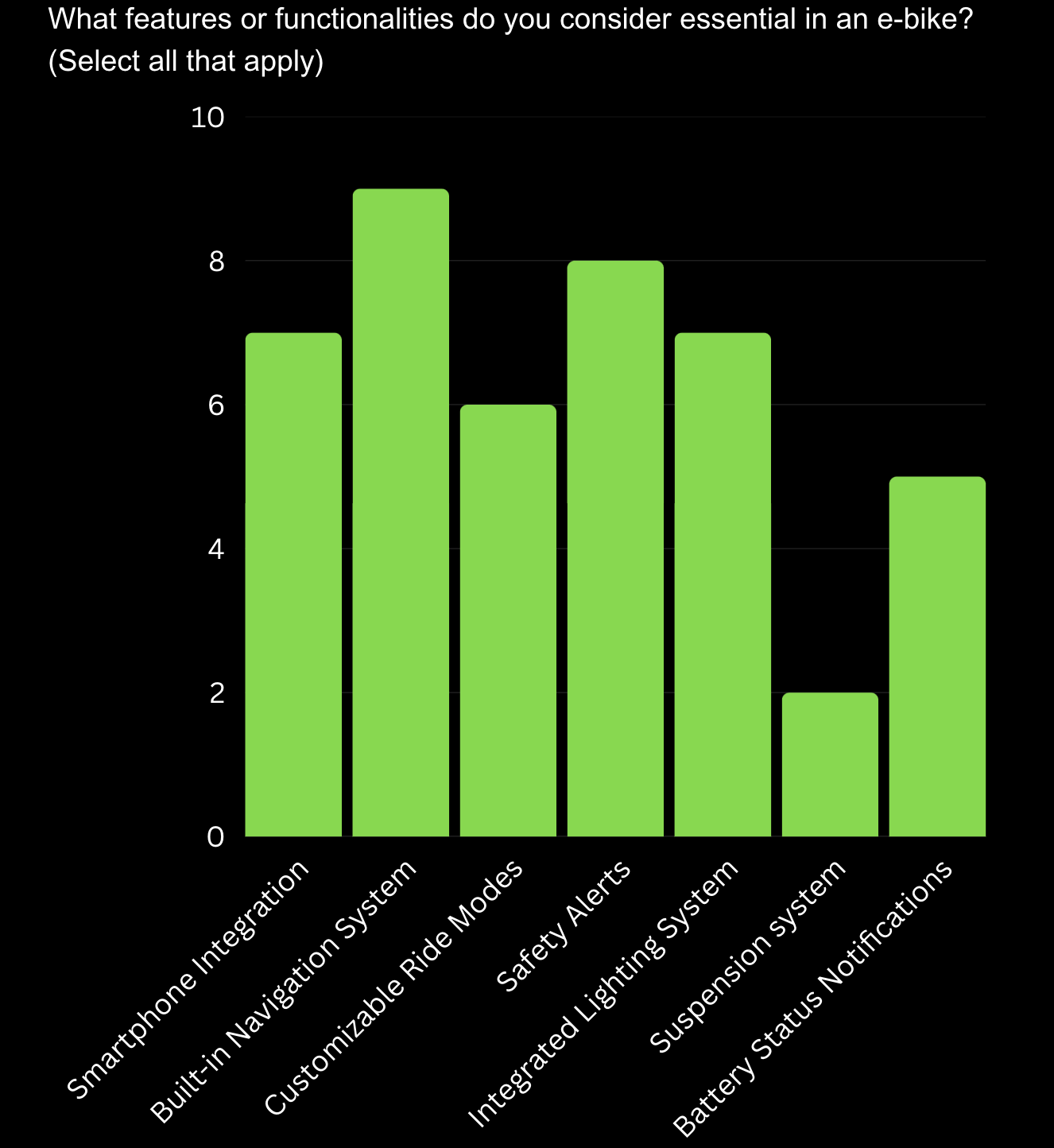
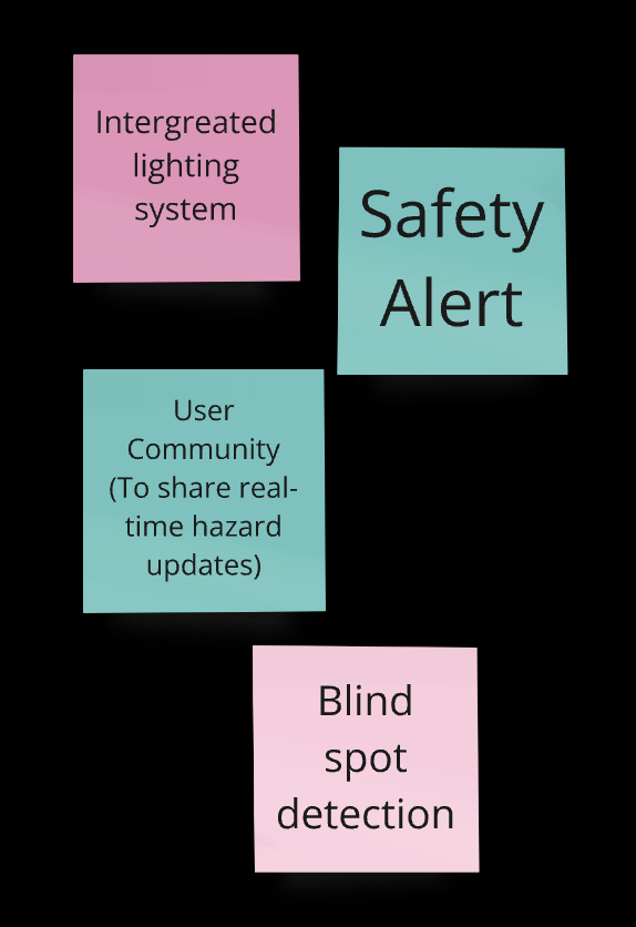
Essential Features: "Built-in Navigation System" and "Safety Alerts" are the top priorities, followed by "Customizable Ride Modes" and "Integrated Lighting System," showing user demand for safety, navigation, and adaptability.
From the survey, we also found out that:
66.7% of participants are interested in joining e-bike group rides or events in their community.
50% of participants primarily use PAEB for leisure and recreational rides
70% of participants would like to recommend PAEB to their friends or families who have never experienced it before.
25% of participants are interested in AI integration with PAEB.
Second Survey
Phone Usage Frequency: With 41.67% of participants reporting frequent phone use during rides, this highlights the need for safer, hands-free solutions to minimize distractions.
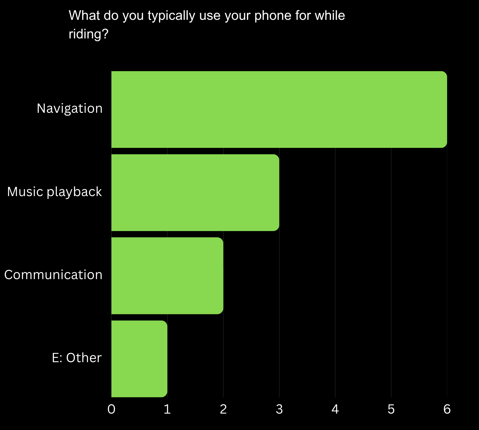
Primary Phone Uses: "Navigation" is the most common reason for phone use, emphasizing the importance of built-in navigation to reduce reliance on external devices.
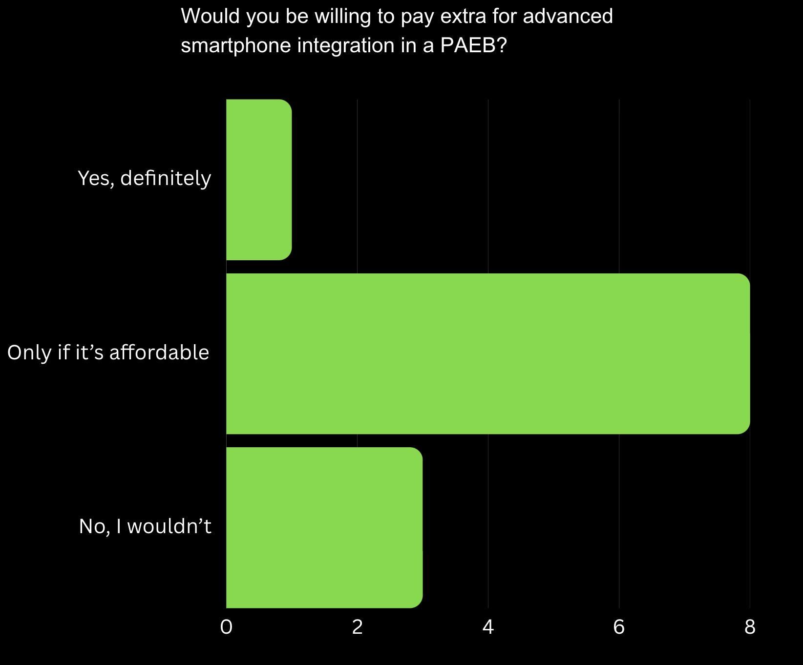
Willingness to Pay: While users are interested in smartphone integration, affordability is a key factor, requiring pricing strategies that balance cost and accessibility.
To better understand how riders use their phones while on a PAEB, we conducted a second survey focused specifically on phone usage habits. By basing this decision on the data from the first survey, rather than assumptions, we wanted to understand the risks and opportunities associated with mobile connectivity in PAEBs.
Brainstorming
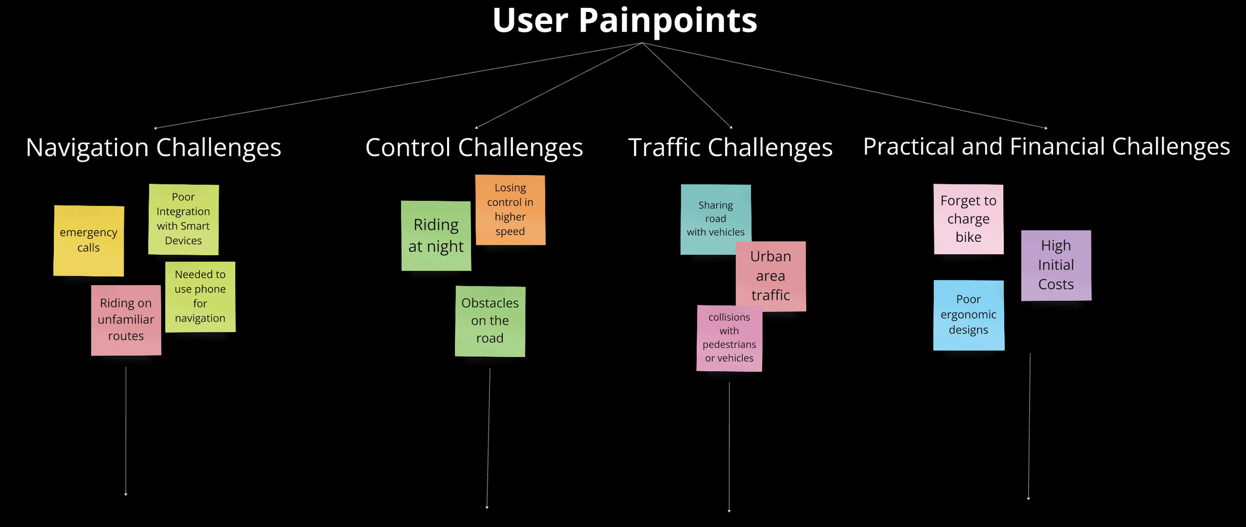
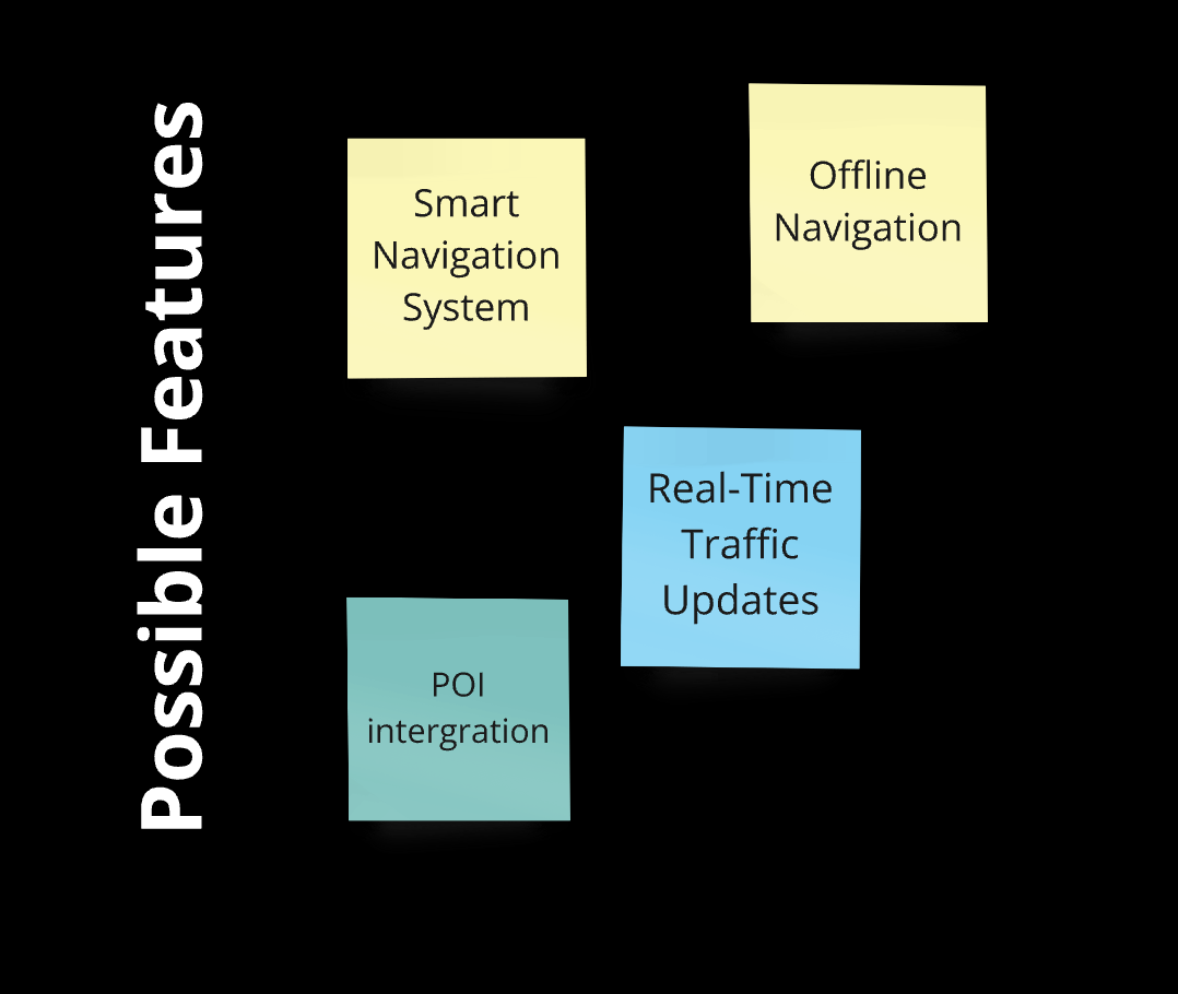
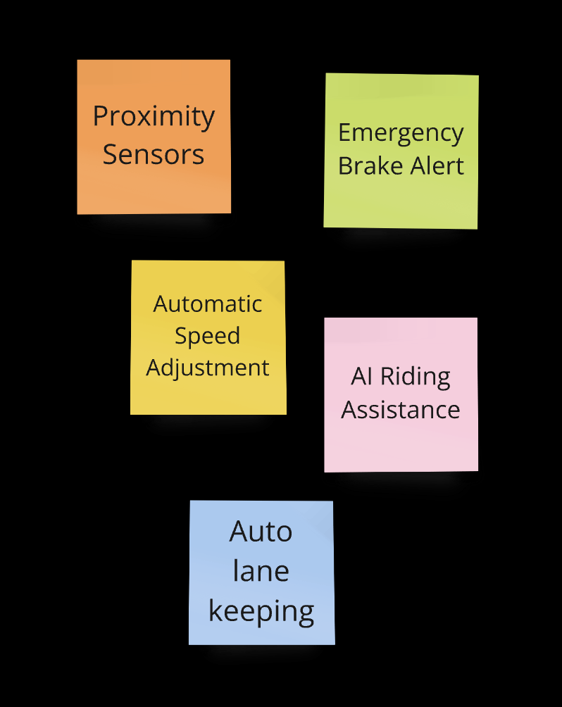
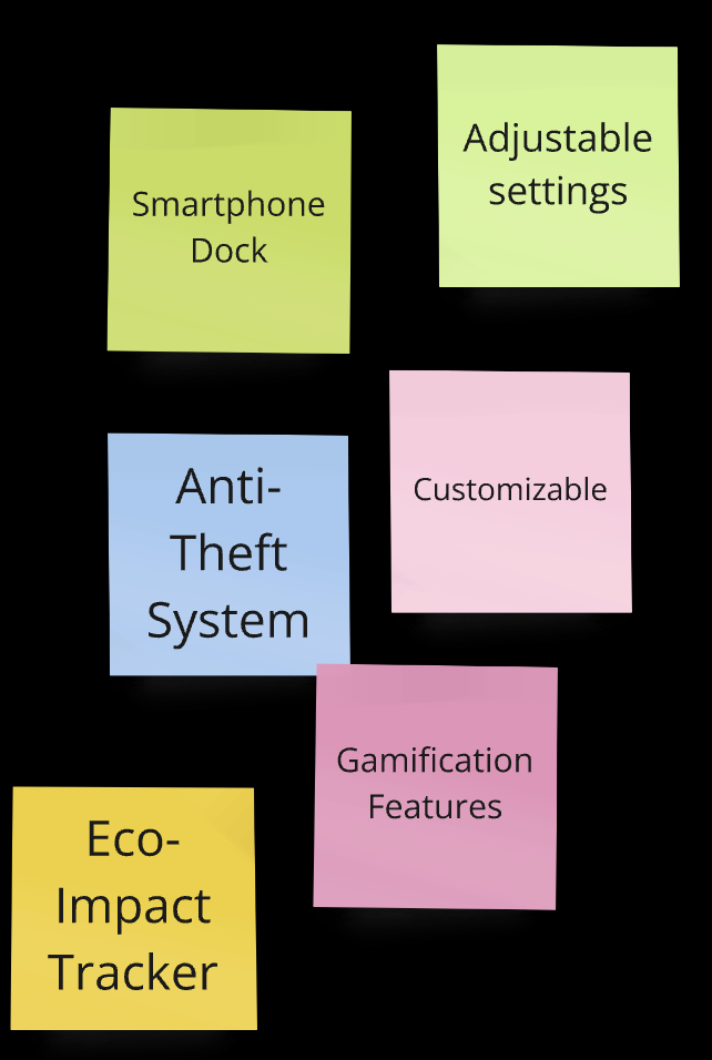
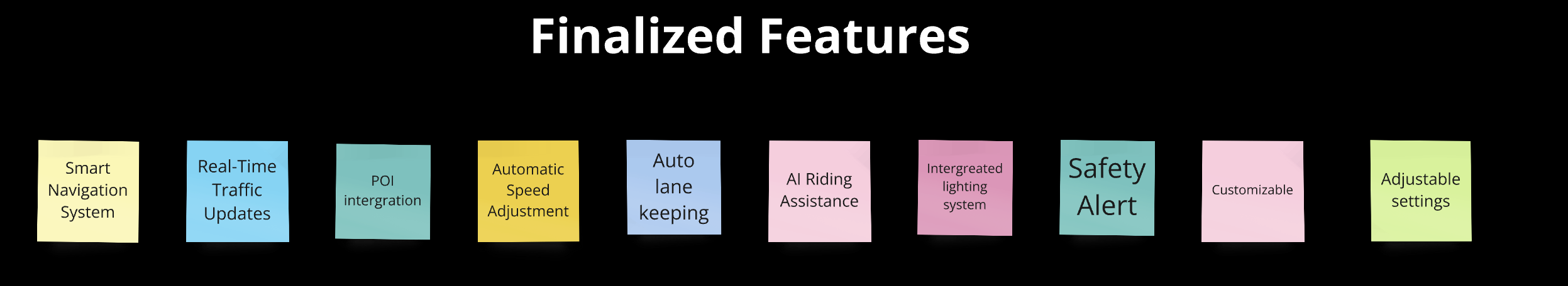
Based on survey insights, we identified four primary challenges users face: navigation, control, traffic, and practical/financial issues. Through brainstorming, we generated a range of potential solutions for each challenge. After careful evaluation, we finalized key features such as a smart navigation system, real-time traffic updates, safety alerts, and Auto lane-keeping to form the core of our product.
Immersive Design
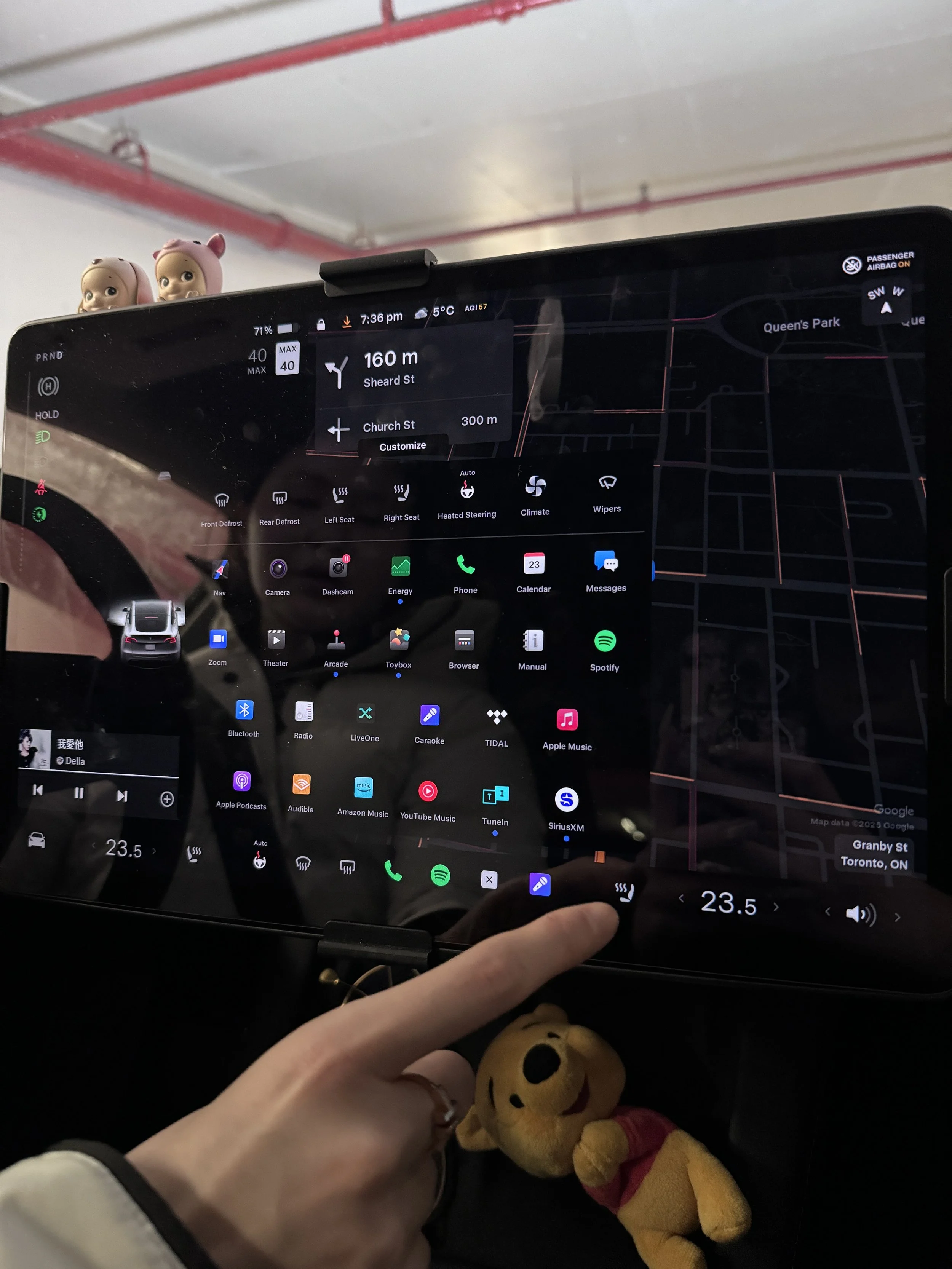
Recognizing that designing a smart, integrated system with diverse user-centered features for e-bikes is an innovative concept, we began by conducting immersive design research to better understand how current products meet user needs. We compared the Tesla Model Y’s screen with existing integrated devices on Zygg e-bikes, identifying gaps, opportunities, and areas for improvement.
Due to the project’s time constraints, we were only able to complete one sample for each object. We are aware that expanding the sample size or sample types and developing a more detailed research plan will be needed for future product development and refinement.
1
Interaction Method
Evaluate what finger the driver/rider would naturally use for interaction

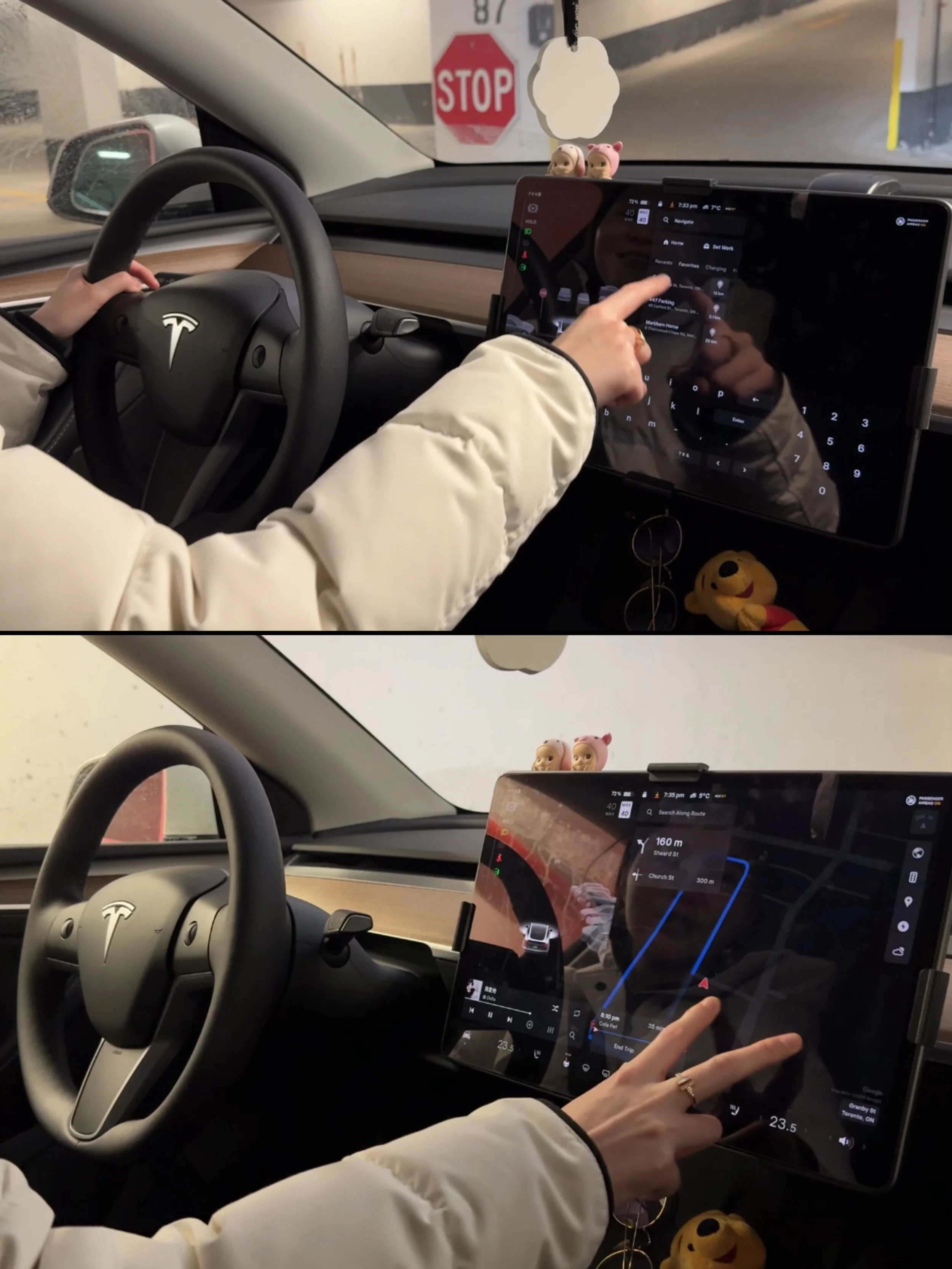
The driver naturally use their right index finger to tap on the Tesla’s screen.
The driver can either let their hand hang freely or rest their arm on the center console to perform the operation smoothly while driving.
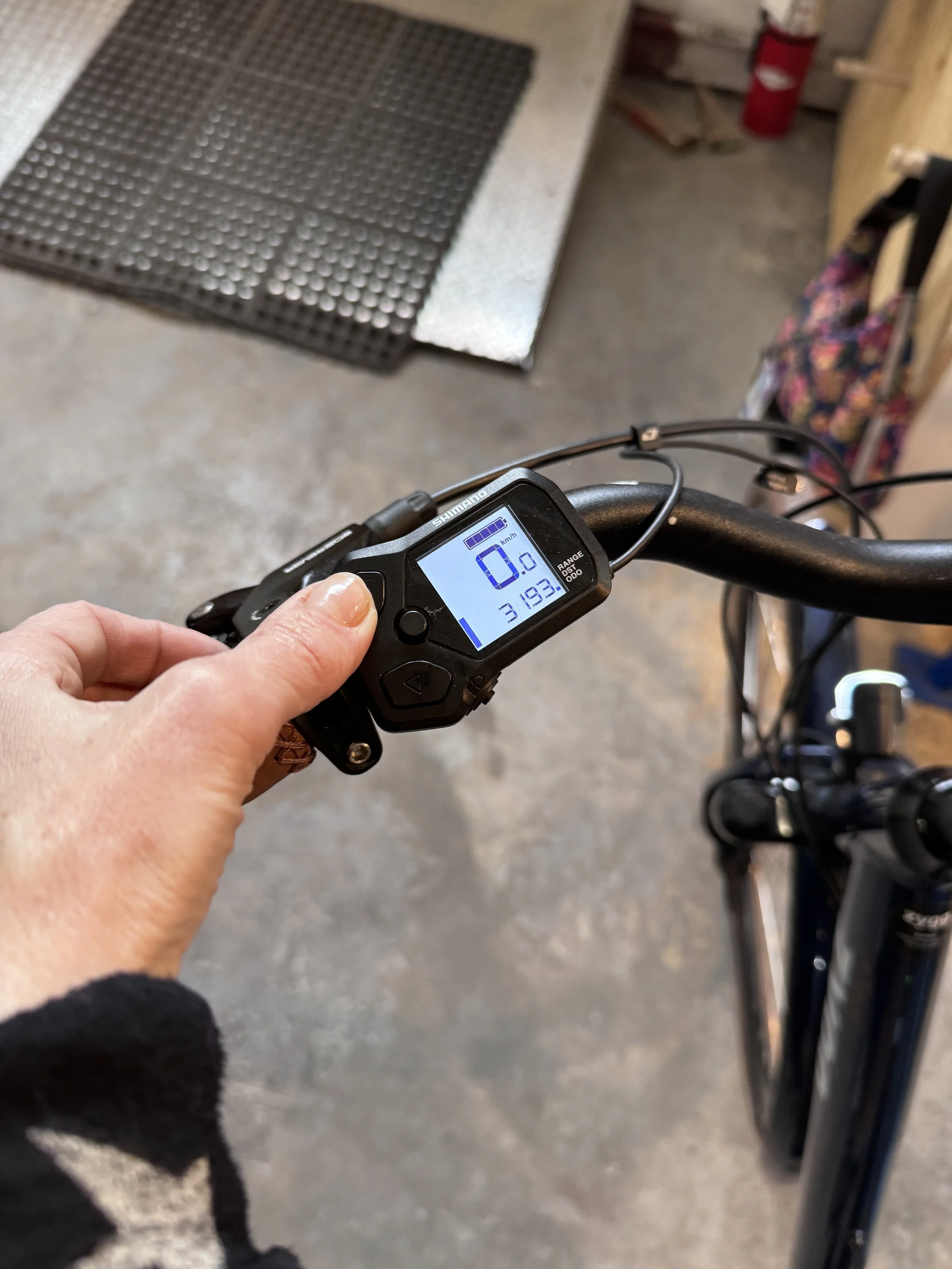
The Zygg Model A’s device requires users to press a button using their left thumb to switch modes.
2
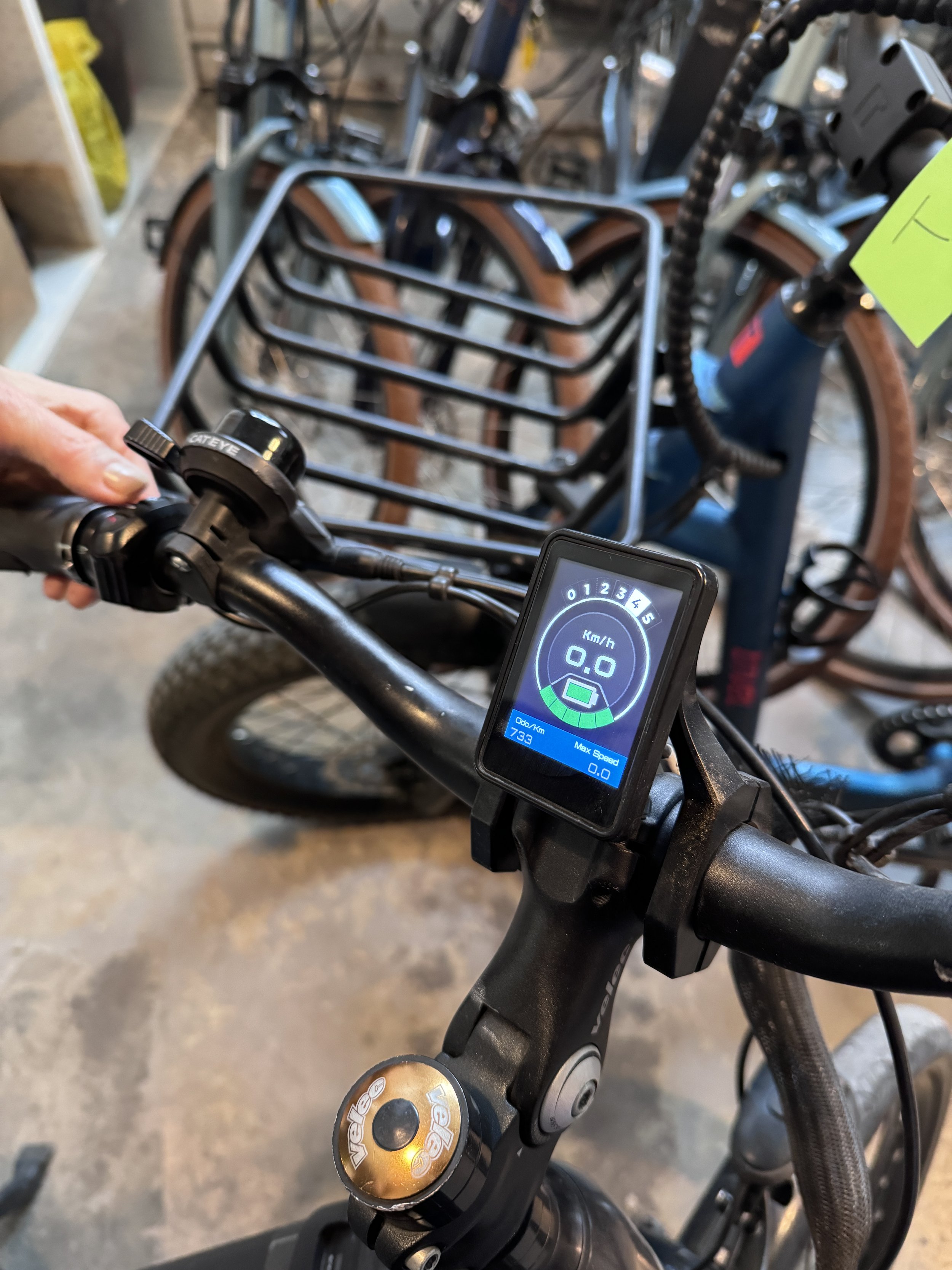
The Zygg Model Qx’s device allows users to switch modes by rotating the wheel located on the left-hand side.
Attention Span
Measure how long the driver/rider glances at the screen before safely returning to the road
It takes the driver 3-5 seconds to complete one task
3
The user takes 1-2 seconds to switch modes on Zygg’s Model A.
Screen Reachability
Observe how the driver/rider positions their hand while interacting with the screen
4
When the rider removes one hand from the handlebar or the corresponding side of the bike's frame, the bike's stability is immediately compromised.
Imagination: if the screen allows the rider to interact without letting go of the handlebar, the bike remains more stable.
Physical Feedback
check if the audio feedback could reduce the driver/rider’s distraction, or if people habitually rely on visual cues.
The driver stated that she primarily relies on visual cues while driving. Tesla's screen provides highly detailed visual representations of the navigation path and the surrounding environment.
5
From interviews with Zygg’s staff, it was noted that riders habitually rely on self-discovery to navigate their surroundings, using visual cues from the phone navigation as a secondary guide for confirmation.
Audio cues appear to be less significant for either drivers or riders, but further research is needed to validate this observation and determine whether audio feedback is effective.
Task Complexity
Note types of tasks performed on the Tesla screen and define which tasks are feasible and safe for bike riders.
Tesla's screen offers a wide range of features, with navigation prominently displayed at the top and secondary features arranged below in a grid layout. When driving, Tesla limits access to certain features such as browsing apps or detailed settings to minimize distractions.
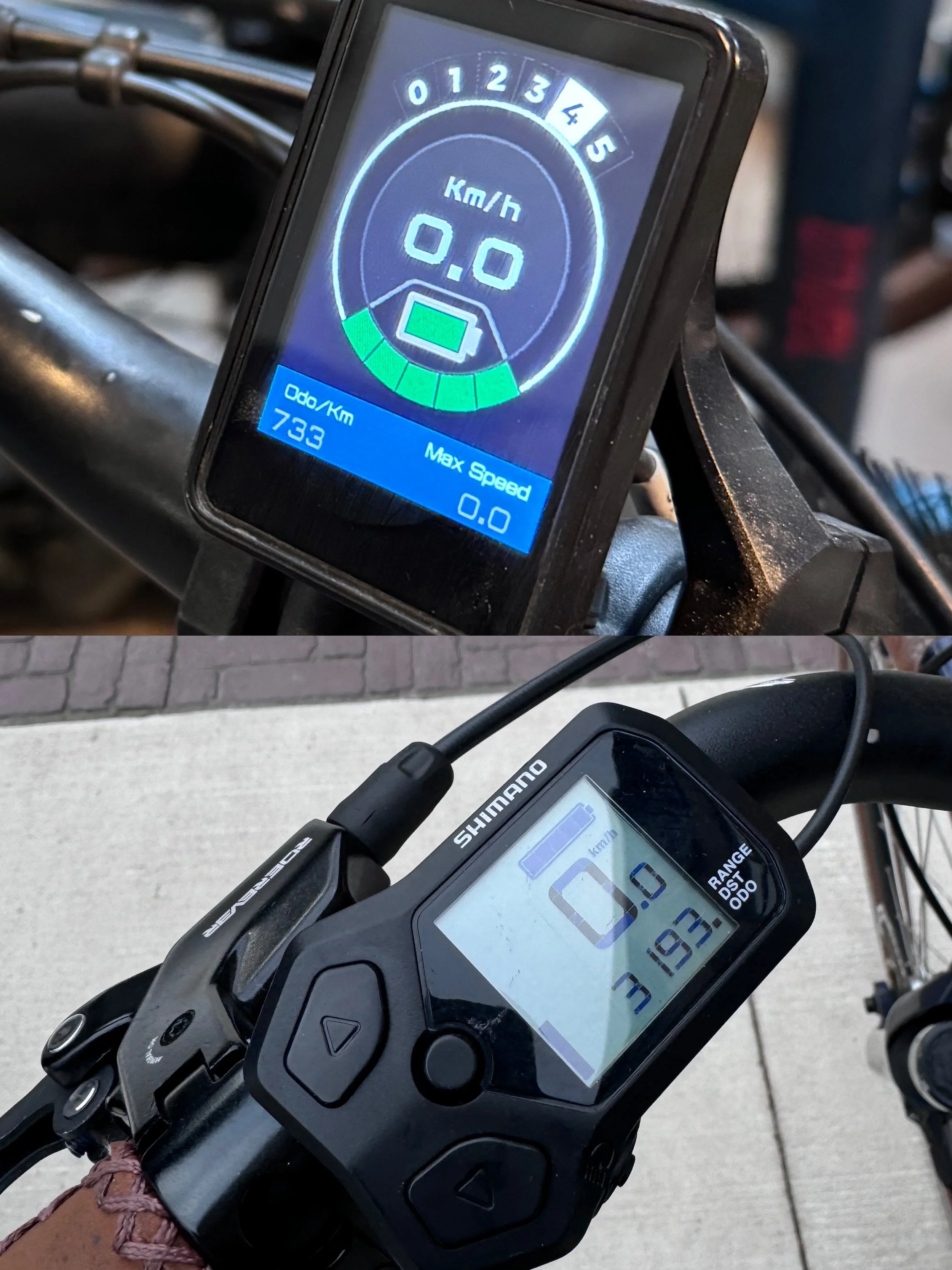
Both Zygg models display speed, battery range, history travel range, and current mode. We understand that our product design must focus on the trade-off between simplicity and functionality.

Product Design Process
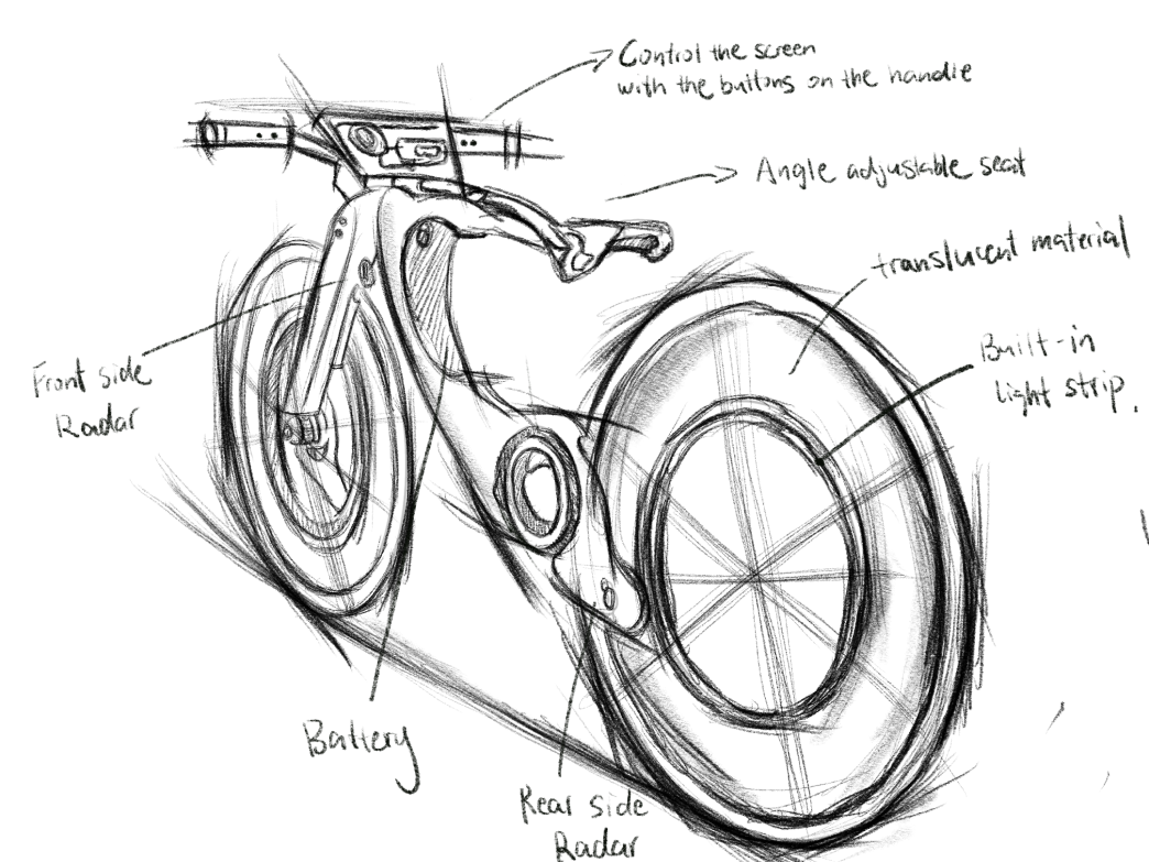

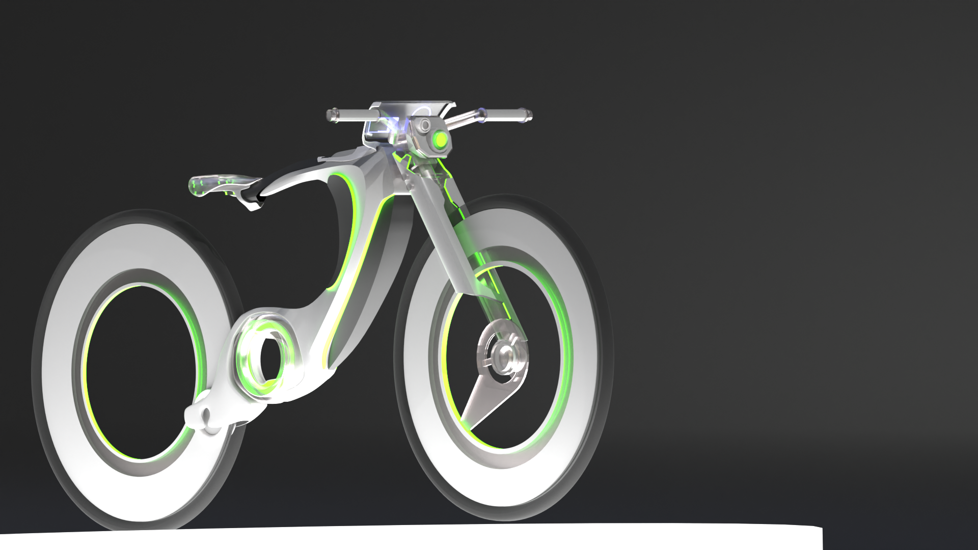
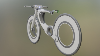
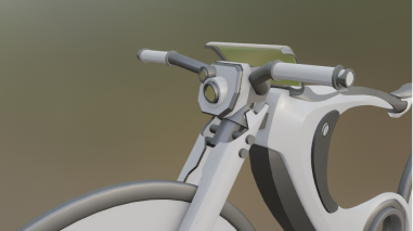
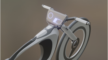
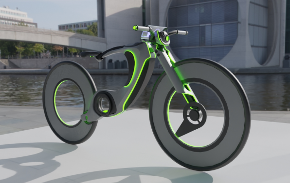
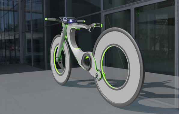
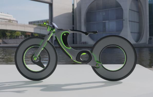
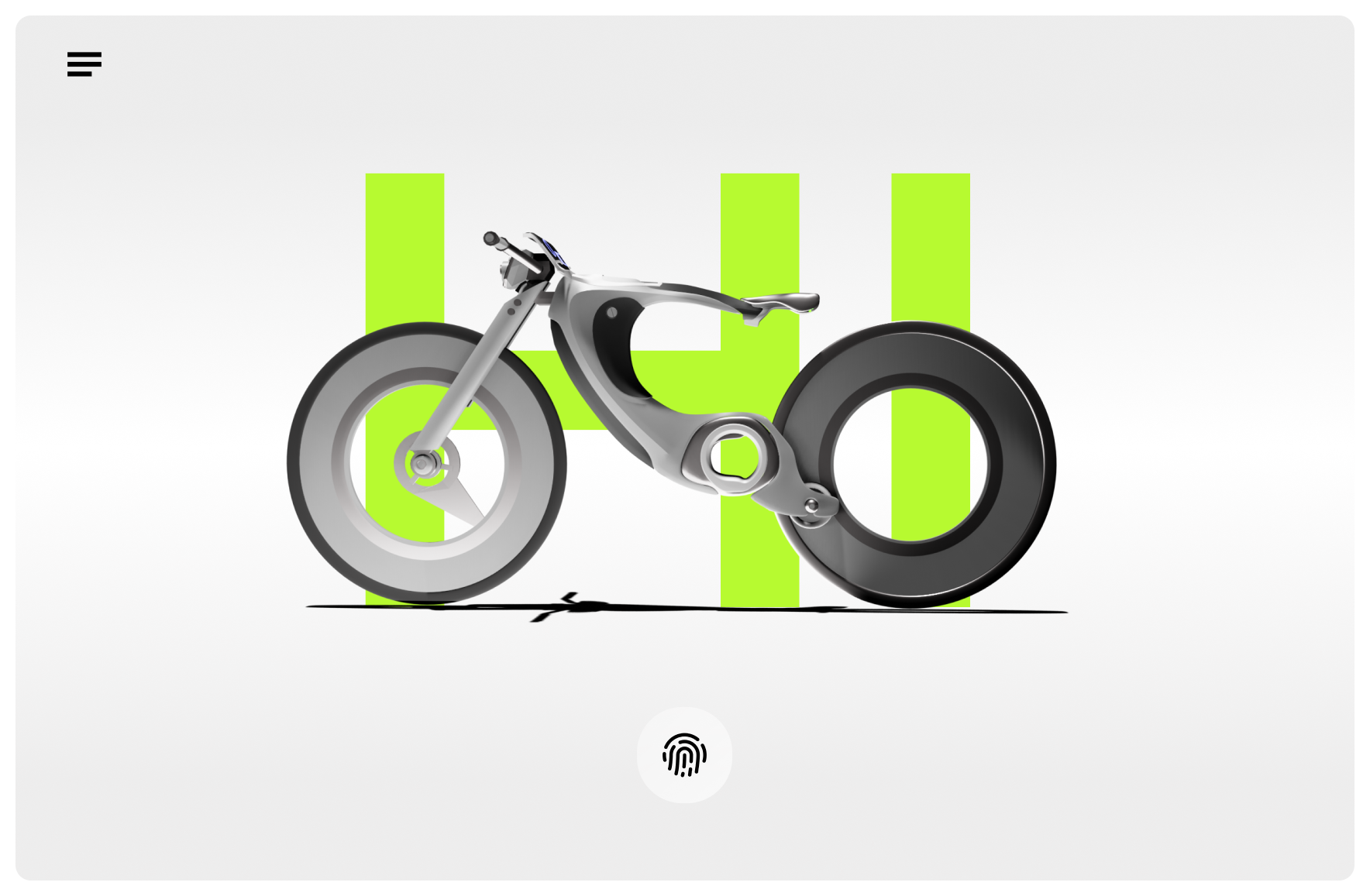
In designing Hi-bike’s appearance, I mainly focused on aesthetic cohesion and enhanced functionality. The battery, motor, and other core components have been implemented within the bike’s frame to achieve a simplified look.
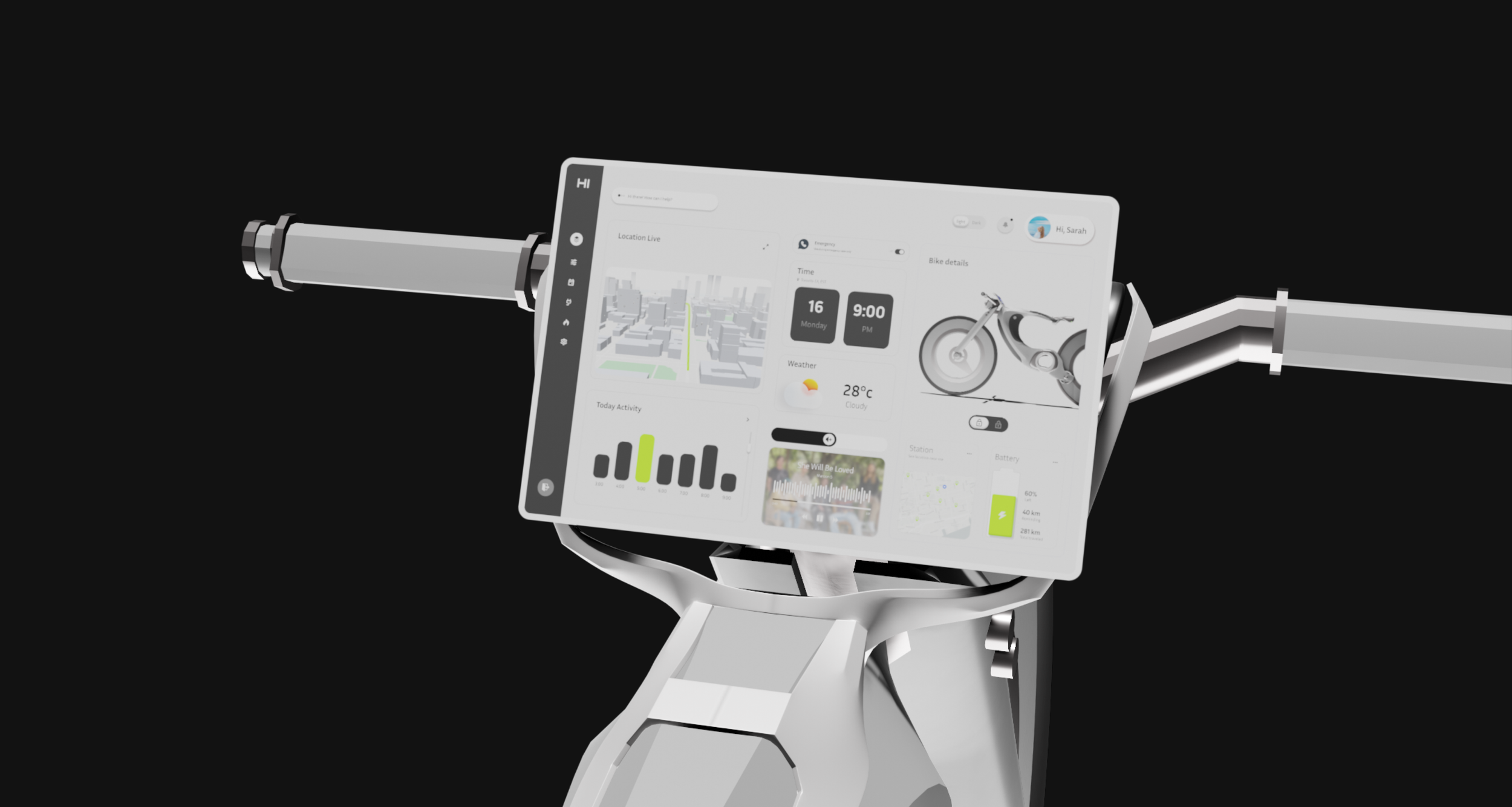
Additionally, the Hi-Bike features a larger LCD display compared to competitors, offering a user-friendly interface with expanded functionality. Other innovative elements include an angle-adjustable seat for customizable comfort and built-in light strips for improved visibility and safety.
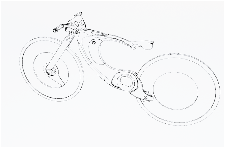
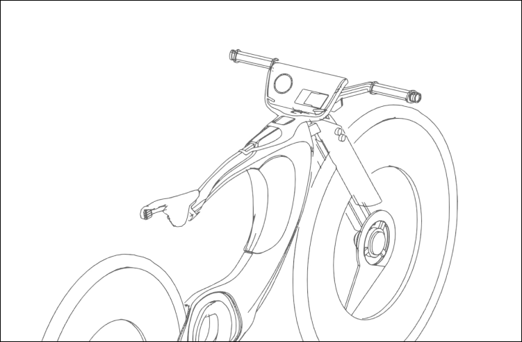
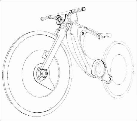
More line drawings to show the product’s structural view
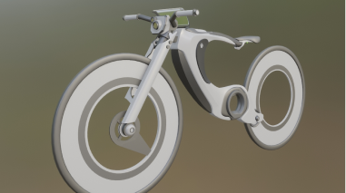
In the product prototyping stage using Blender, I focused on perfecting the bike’s overall shape and key features before applying realistic textures and materials.
User Flow

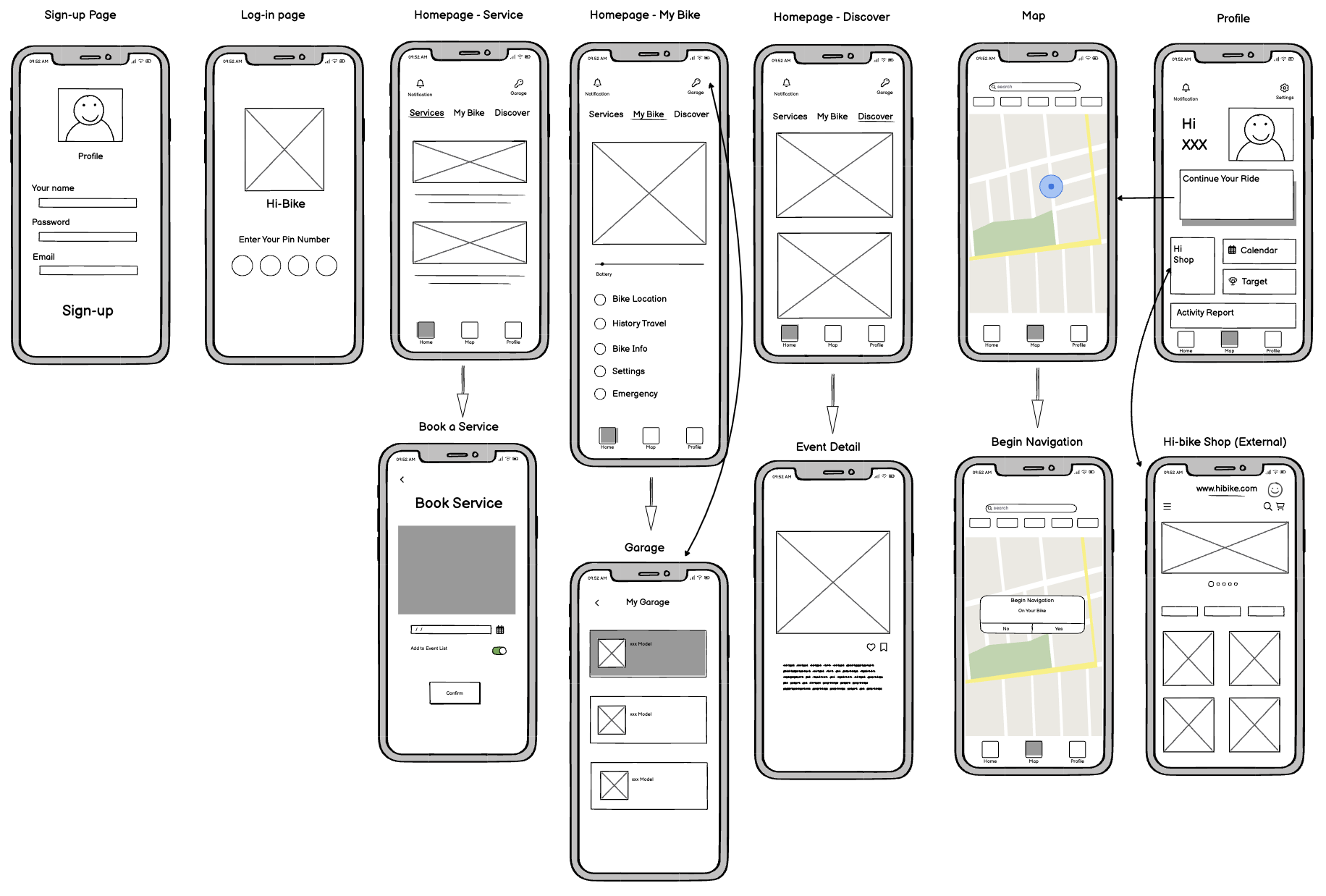


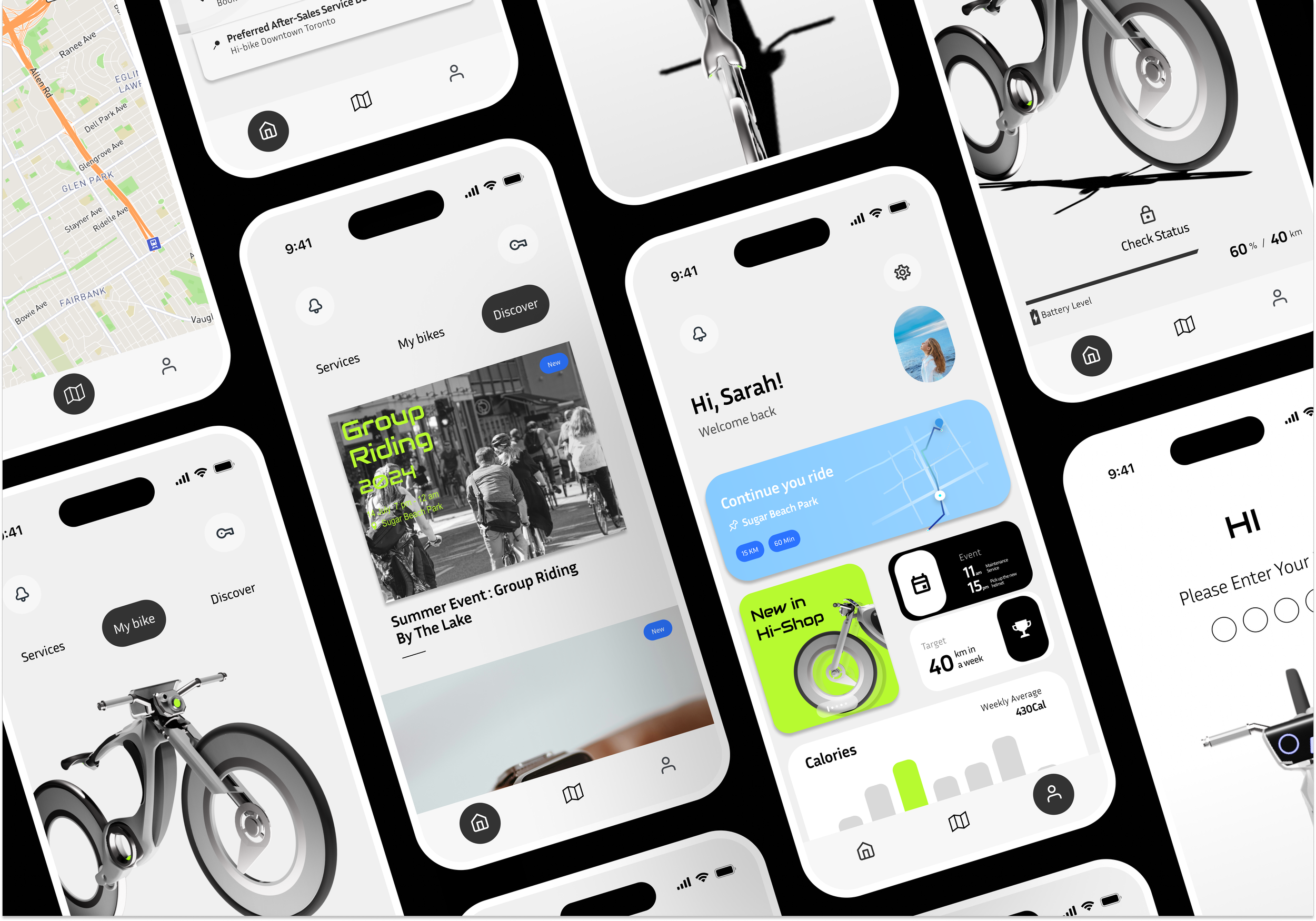
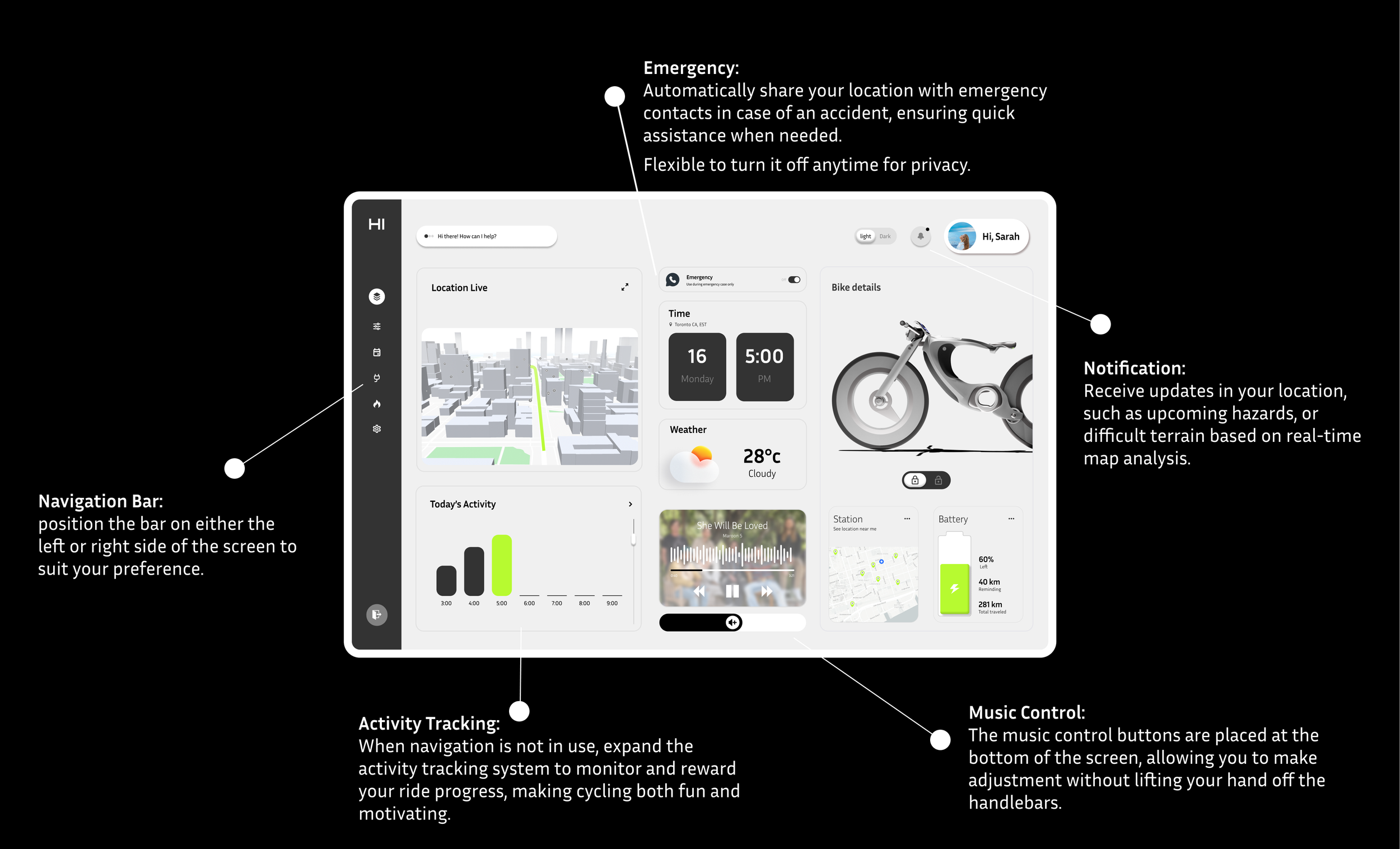
Homepage-Status
The status page displays a 3D model of the bike, allowing users to check the bike’s condition such as the battery level and estimated range. More detailed settings such as VIew History Trips, and My Emergency Contact will be located underneath.
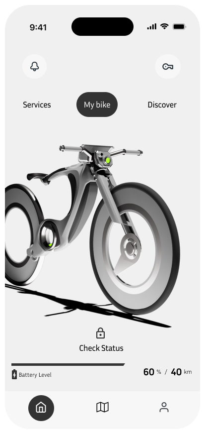
Homepage-Service
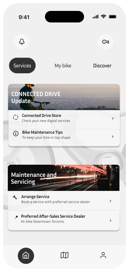
The services screen is designed to offer easy access to bike maintenance and updates. Users can check for software updates and access tips for bike upkeep. Additionally, the screen provides quick links to arrange servicing appointments and find preferred after-sales service dealers. This feature simplifies bike maintenance, ensuring that users can keep their bikes in top condition with minimal hassle.
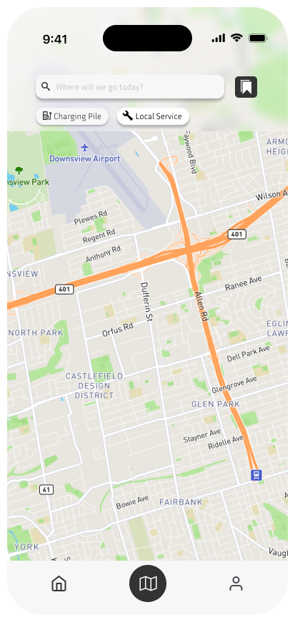
Map
The Map screen is designed to be directly connected to the Hi-Bike’s display. Users can search for destinations, locate nearby services like charging stations, and easily plan their routes. Once an address is entered in the app, the navigation is automatically synced to the bike’s screen, allowing for hands-free guidance while riding.
Homepage-Discover
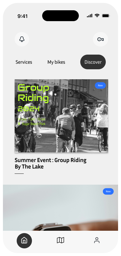
The Discover screen helps users engage with the Hi-Bike community and stay updated on upcoming events. It highlights activities like group rides and social events, encouraging users to explore new experiences and connect with other riders. This section also features updates on new features and services, making it an excellent resource for users who want to make the most out of their Hi-Bike.
Profile
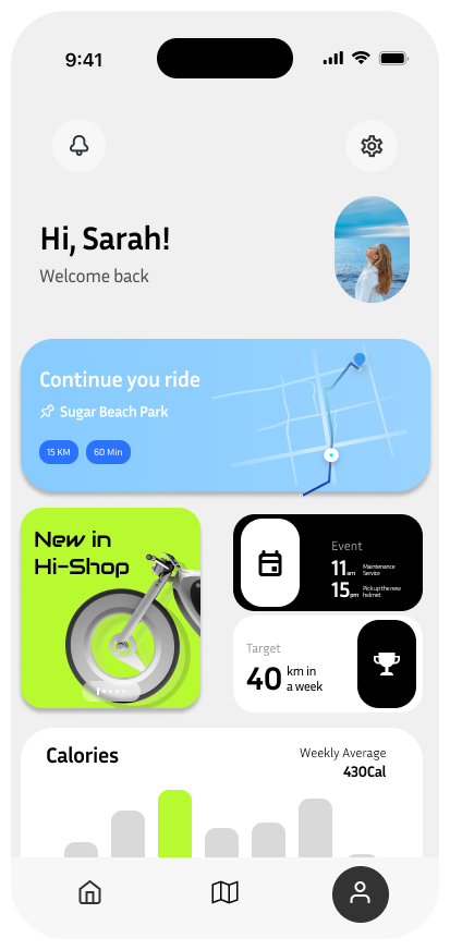
The Profile screen provides a personalized dashboard for users, featuring activity stats, ongoing rides, and new updates from the Hi-Bike ecosystem. Users can quickly resume their last ride, view upcoming events, check their weekly distance goals, and track calorie expenditure. This tailored interface keeps riders informed and engaged, offering insights into their biking habits and promoting a more connected riding experience.
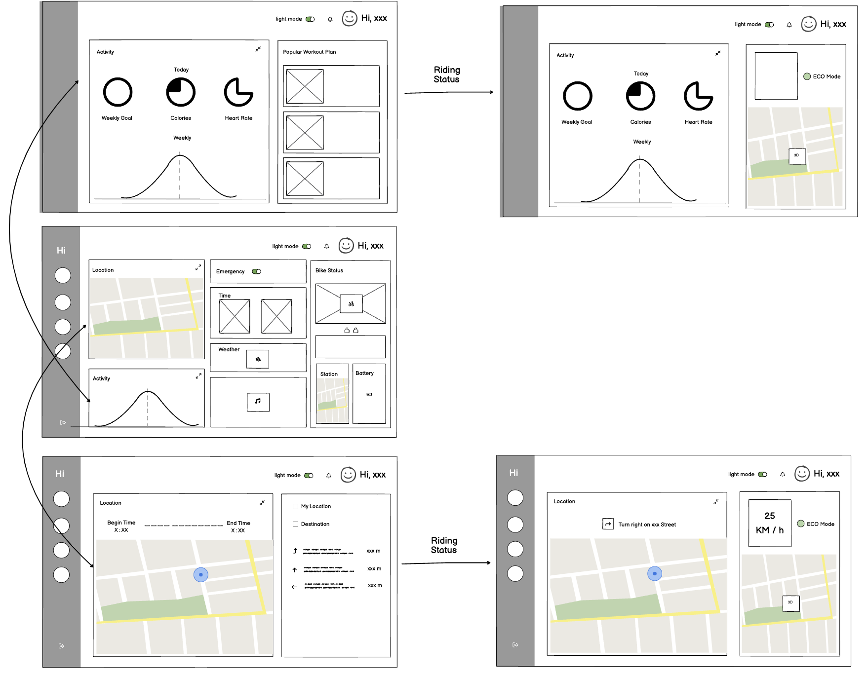
Welcome Screen
The Welcome Screen is the initial interface on the Hi-Bike’s built-in display. It requires the user to unlock the bike using a fingerprint, ensuring a secure and personalized experience. From the hamburger button at the top left corner, users can also switch profiles, toggle between light and dark mode, or access quick settings such as connecting Wi-Fi or Bluetooth.
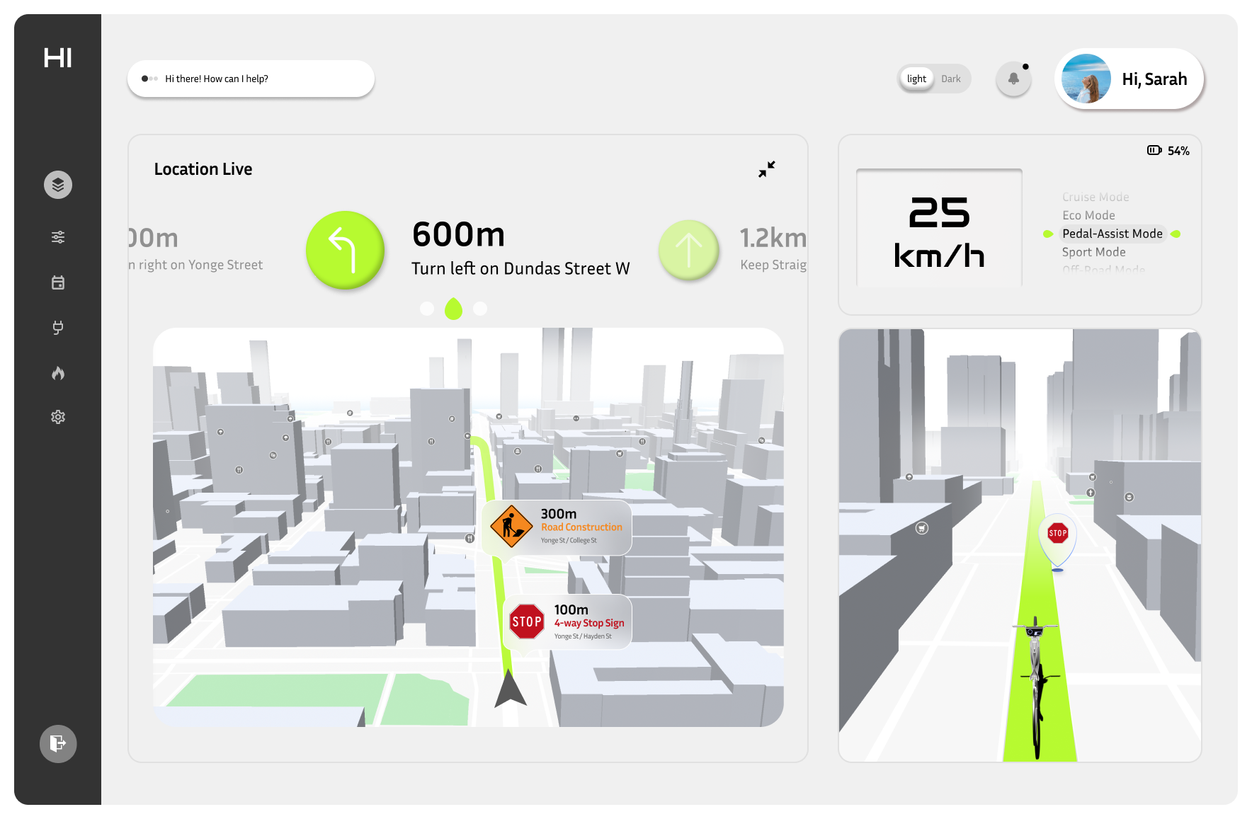
Navigation Screen
The Navigation Screen provides users with a real-time, interactive view of their route. It displays essential information such as turn-by-turn directions, upcoming road hazards, and key points of interest along the route. The interface is designed for at-a-glance interaction, with prominent visual cues and minimal text to avoid distractions.
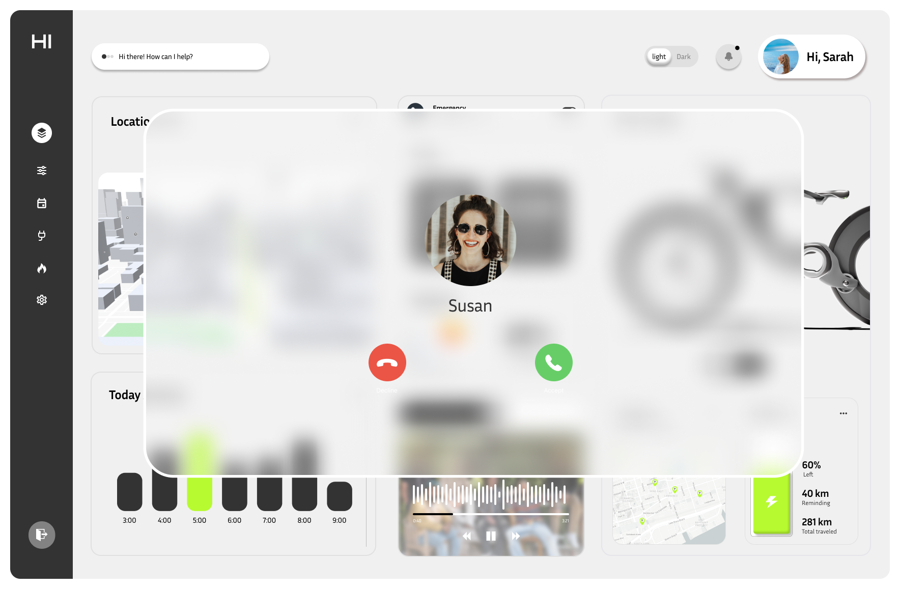
Incoming Call Screen
Road safety was our top priority. The integrated screen allows users to handle essential phone tasks, such as answering important calls, without needing to touch their phone while riding.